eBay selling

2023
eBay
Project Lead
My Impact
I led this project from a design standpoint—from defining goals to execution and QA. It began with a close collaboration with PM partners to establish a vision that secured leadership buy-in and funding. Once on the roadmap, I set the direction and orchestrated design efforts, driving research, facilitating workshops, overseeing designers and content strategists, and identifying opportunities beyond my immediate scope. I also fostered collaboration with engineers—a relatively new practice at eBay—to align design efforts with development timelines, ensuring efficiency and agility.
Background
eBay’s native app serves over two million unique sellers daily. Over the past five years, seller growth across different business sizes led to increasing friction. Both qualitative and quantitative data indicated that the app wasn’t scaling alongside seller needs, with key functionality gaps hindering sellers managing their business on the go. Every month, 10% of customer complaints submitted via page feedback (about 600 messages) related to missing features in the app.
Goal
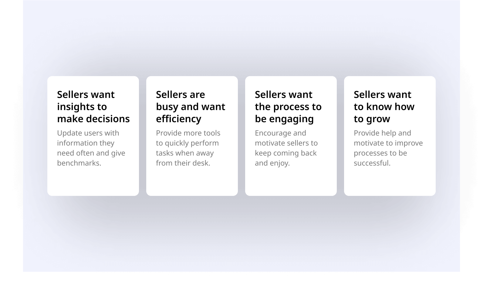
Create an engaging and effortless mobile selling experience that empowers all sellers—casual and business alike—to efficiently manage their activity on the eBay app.

Solution
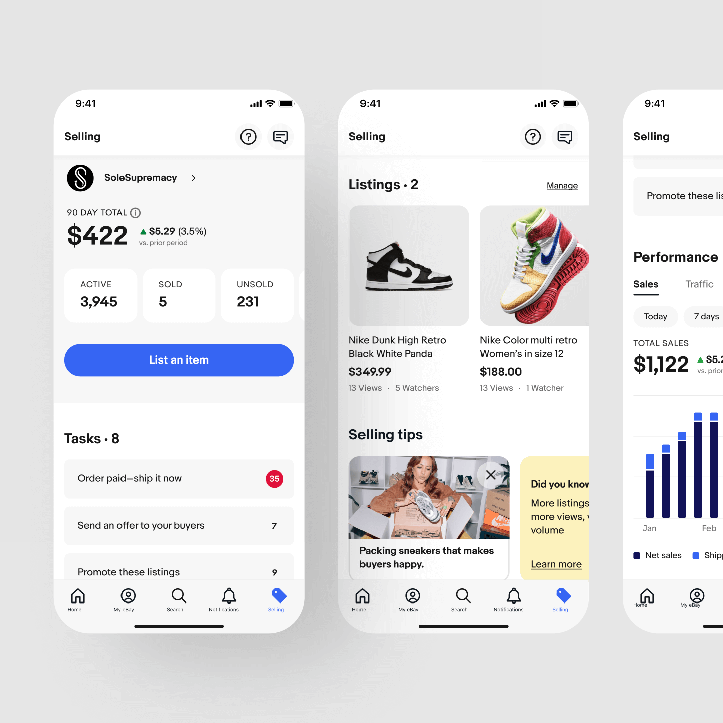
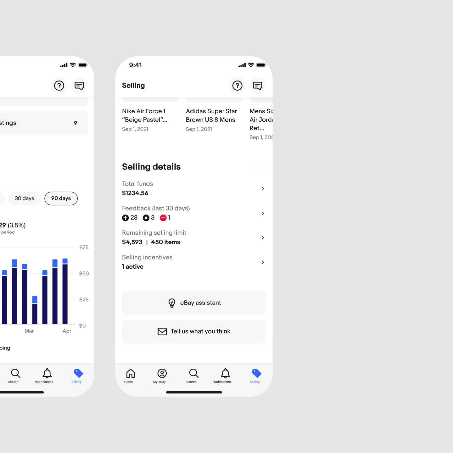
The project was divided into multiple phases, beginning with an investment in the framework—redesigning the selling overview page and rewriting code to modernize the app. On the design side, I focused on improving how we engaged with sellers by refining page architecture to emphasize high-level information while allowing users to drill down when needed. For example, I introduced a selling details module that highlighted key tertiary information and provided quick access to relevant sections.
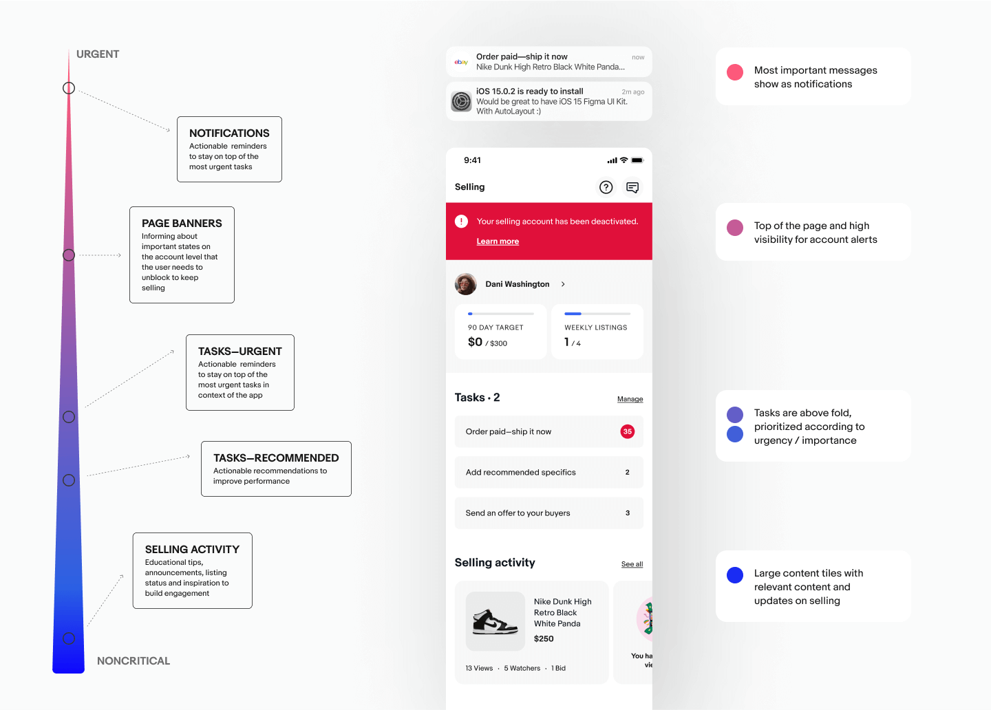
Many incremental improvements addressed long-standing user frustrations, such as improving affordances and making frequently used sections easier to access. The new overview page included a direct entry point to the user profile, which had previously been difficult to find. I also restructured the hierarchy of the selling overview to prioritize the most critical information. Modules that sellers checked often, like tasks, were moved to the top of the page for better visibility.
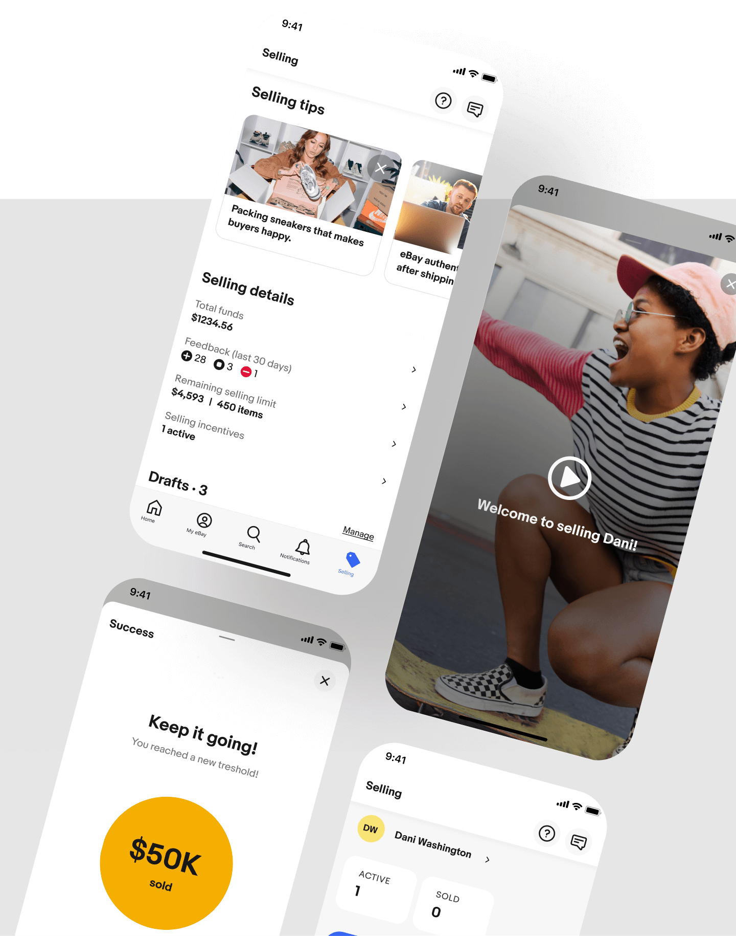
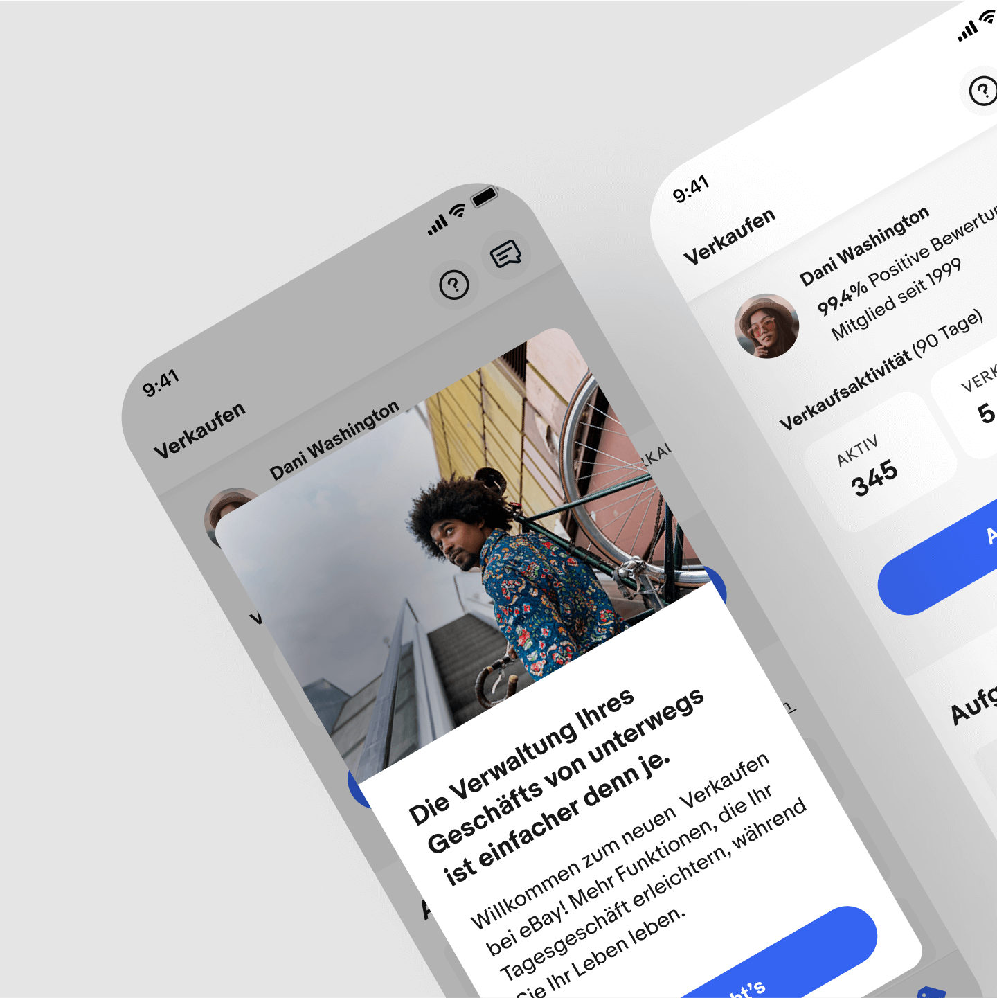
Another major enhancement was in-app education, particularly for new sellers with many questions. The design introduced contextual articles triggered by seller activities, ensuring that resources were always relevant to the individual journey. For example, an article about the Authenticity Guarantee program would only appear if a seller listed an item that qualified for it.
Initial post-launch metrics for Phase 1 were overwhelmingly positive: 89% of respondents reported being extremely satisfied or satisfied.
Challenge
The project took place amid organizational shifts, with changing leadership and shifting priorities between addressing casual or business sellers needs. Fortunately, our scalable framework accommodated both, allowing for flexible prioritization without compromising long-term goals or re-thinking the entire approach.
Process
The process followed a typical product development framework but incorporated elements of Jobs-to-be-Done to maintain a customer-centric approach. I facilitated a need-defining workshop and conducted a competitive analysis—not by comparing feature parity, but by examining how other apps fulfilled seller needs. Once we developed a hypothesis and design prototype, we tested our ideas in key markets, including Germany, which provided valuable culture-based seller insights.
My focus in the first phase was on extending the app framework, which had grown organically into an unruly page. I established a structured approach to communication patterns across the selling experience, defined logic for contextual help content, and introduced tips tailored to different selling categories. Systematizing patterns and transitioning to a new tech stack required tough prioritization decisions. I balanced project scope constraints with long-term user experience and engineering efficiency, ensuring that we invested time where it mattered most. In some project stages, researcher resources were unavailable. To keep gathering insights, I created a user study plan and conducted user interviews with my PM partner.
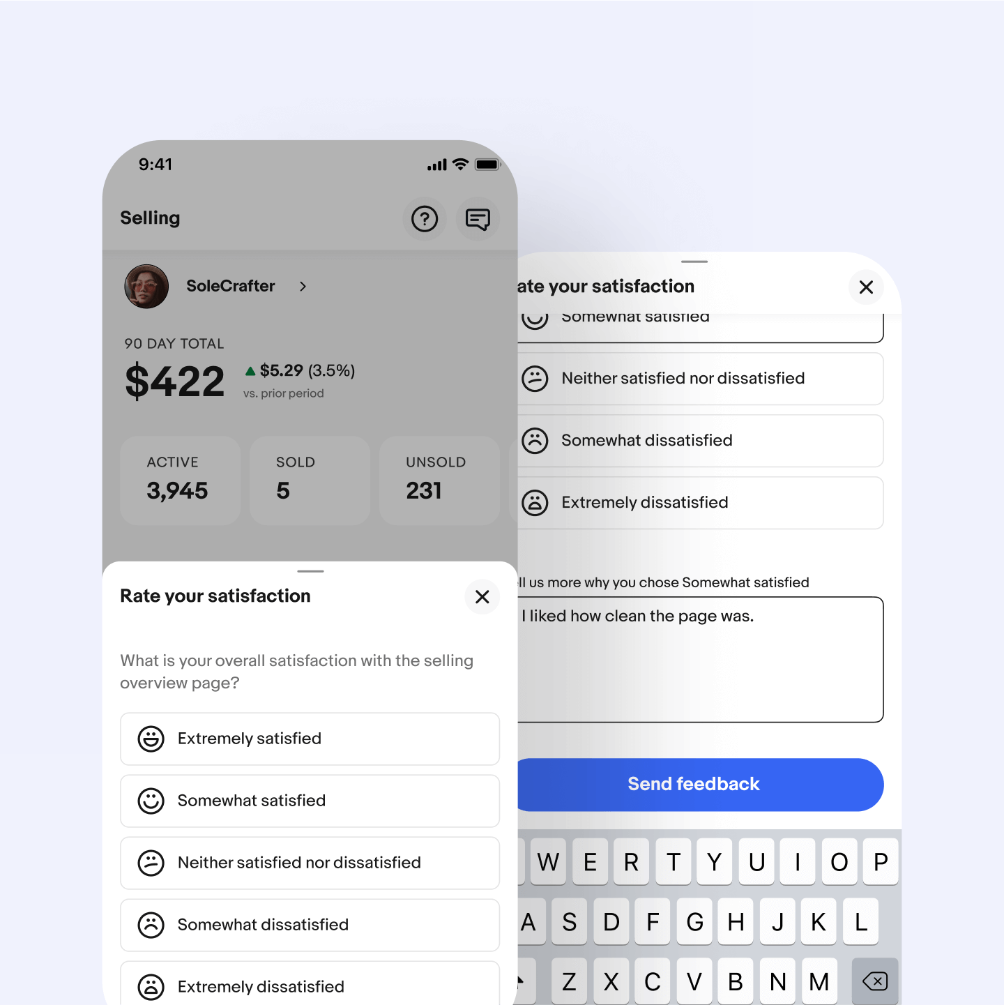
Intercept feedback
Launching the new selling overview page also provided an opportunity to improve how we measured customer satisfaction. Previously, seller feedback relied on a user-initiated form, leading to an unbalanced and incomplete understanding of user needs. The goal was to capture feedback from a broader, more representative sample and increase response volume.
The new design introduced a simple and engaging feedback flow, which significantly improved both metrics. After launching on the native app, the same approach was later adopted by other teams for the web experience.
Accessibility
Accessibility was integral to the design solution, as in all my projects. My approach included consulting with the accessibility team as needed, ensuring accessibility was part of design handoff discussions with engineers, making accessible demos a must-have in every demo, and identifying bugs during QA.
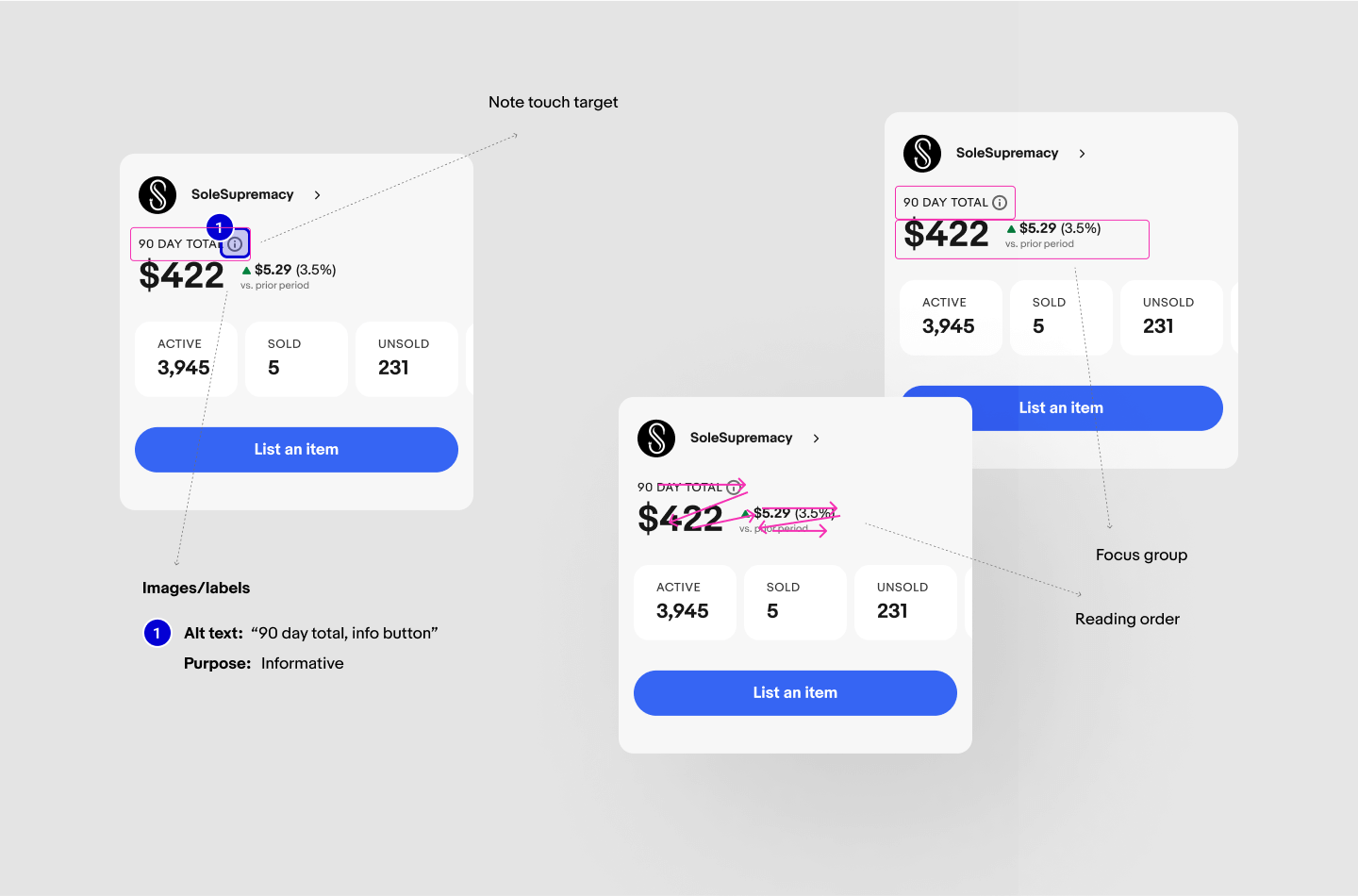
We were also the first team at eBay to investigate the largest sizes of the Dynamic Type feature in iOS, leading to the definition of truncation patterns. These patterns were later integrated into the design system and became part of foundational component behavior.
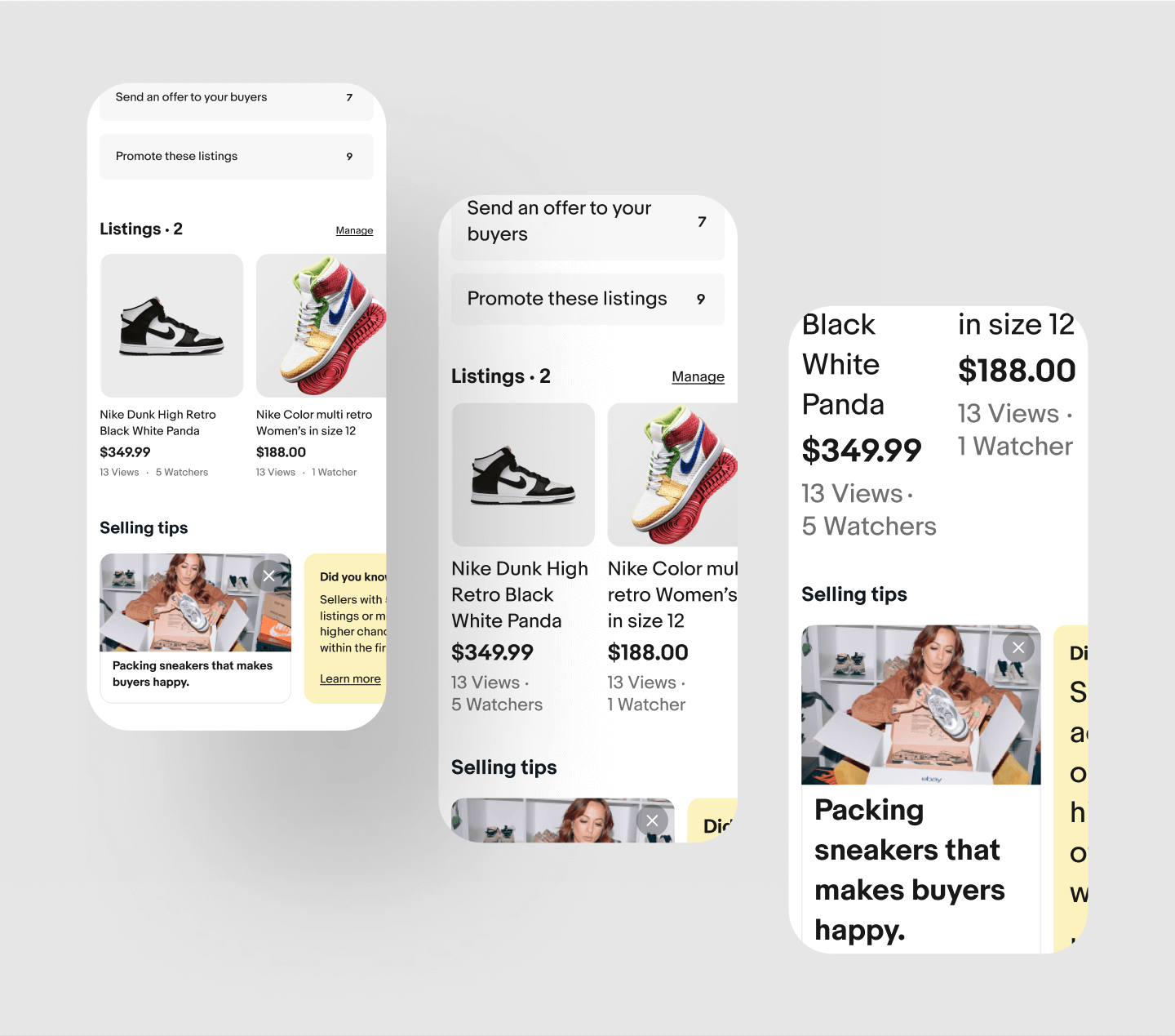
Business sellers
Once the foundational work was complete, we shifted focus to business sellers, adding advanced features that improved efficiency. One of the most requested was bulk functionality for sending offers to buyers. I designed a simple flow for setting percentage discounts, mirroring the web experience but streamlining it for clarity and ease of use. To support this, I restructured the action bar at the top of the page to accommodate bulk actions.
Another key enhancement was introducing performance insights through data visualization. Business sellers needed quick access to key metrics, so we designed graphs that provided real-time insights and helped sellers take action to meet their sales goals. Additional listing details, such as the number of watchers and views, were included alongside baseline numbers and period-over-period comparisons to give sellers clear performance benchmarks.


Further phases
As functionality expanded, the selling space outgrew its original navigation structure. I led efforts to define an expanded navigation system that ensured sellers could quickly find what they needed without confusion.
Subsequent phases introduced additional enhancements, including more bulk actions, deeper drill-down pages, improved task management, milestone celebrations to build emotional engagement, more contextual selling tips, and space for category-specific content.
