Microsoft Design System
2020
Microsoft
Project Lead
Art Director
My Impact
I was the Art director for the CSEO Coherence Design System and Design Lead for task flow workstream. I led design of components that focused on customer needs through the Jobs-to-be-done framework. I set process and overlooked other designers' component work, ensuring coherency and holistic approach. I was a driver of accessibility for our Design System, led accessibility workshops and contributed to setting Microsoft's standards as a part of a cross-org team. I also drove Microsoft data viz workstream—setting a unified approach to data vis presentation. Throughout my tenure, I built relationships with other design system teams leading to many collaborations and development of common components, making Microsoft products more aligned.
Background
Core Engineering is a Microsoft organization that develops products for internal customers. It covers hundreds of products—from lightweight experiences (intended for casual customers) to data-heavy business applications. The intention for many products built by the Core Engineering teams is to thoroughly test them by the “customer 0”—Microsoft employees—before launching products externally. With so many products, the design coherency went out of hand over the years resulting in some of them not behaving like a part of Microsoft family. It also led to inefficient product development teams building features addressing identical customer needs.
Goal
There has been a need to systematize the approach to product-making and create patterns and flows that bring coherency beyond using individual atomic components. The role of the Core Engineering Design System was to set advanced patterns based on Microsoft’s atomic Design System—Fluent, to improve the overall efficiency of product-making in the org. Our team set up the documentation to be easy to use, contain comprehensive guidance, and meet high accessibility standards. Our team's additional objective was to establish collaboration processes with our studio teams and other design teams within Microsoft.
Challenge
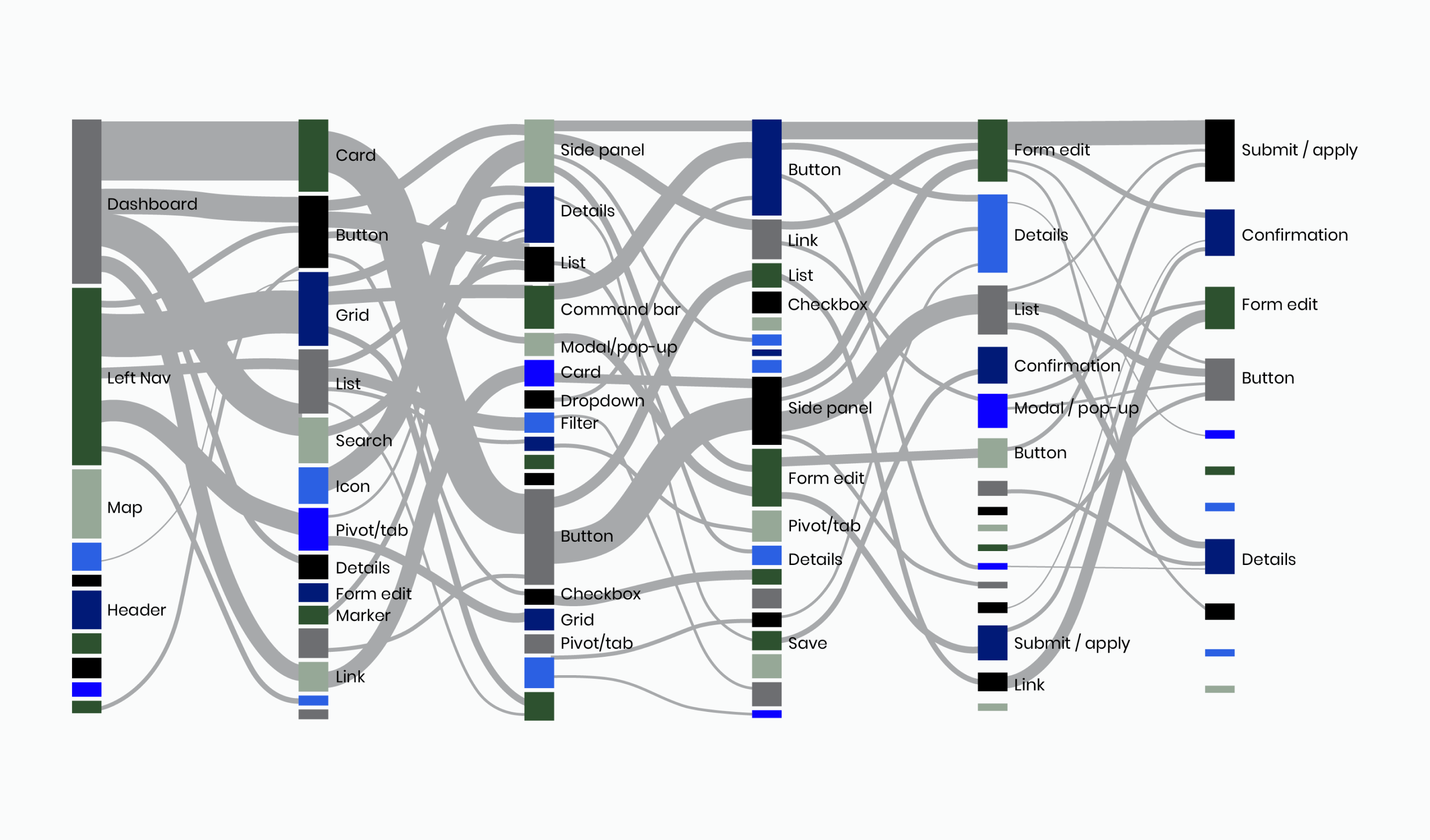
The CSEO products grew organically, developing custom UX solutions along the way. Customers using multiple Microsoft products had to constantly re-adjust mental models when performing similar tasks on different applications. The Sankey chart highlights how various teams decided to use Fluent components in different ways, creating a lot of unnecessary friction for our customers. Additionally, the large organization with hundreds of products and interconnectedness with other Microsoft products brought multiple points of view. It required processes that align teams and facilitate collaboration to establish a common ground.
Solution
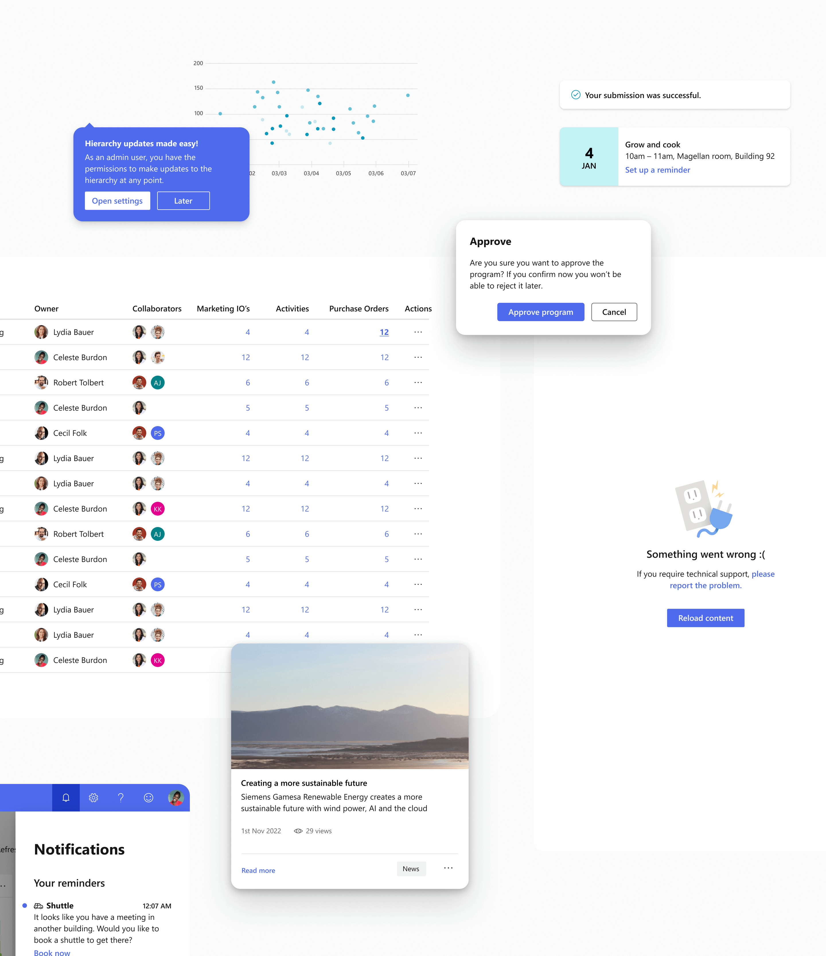
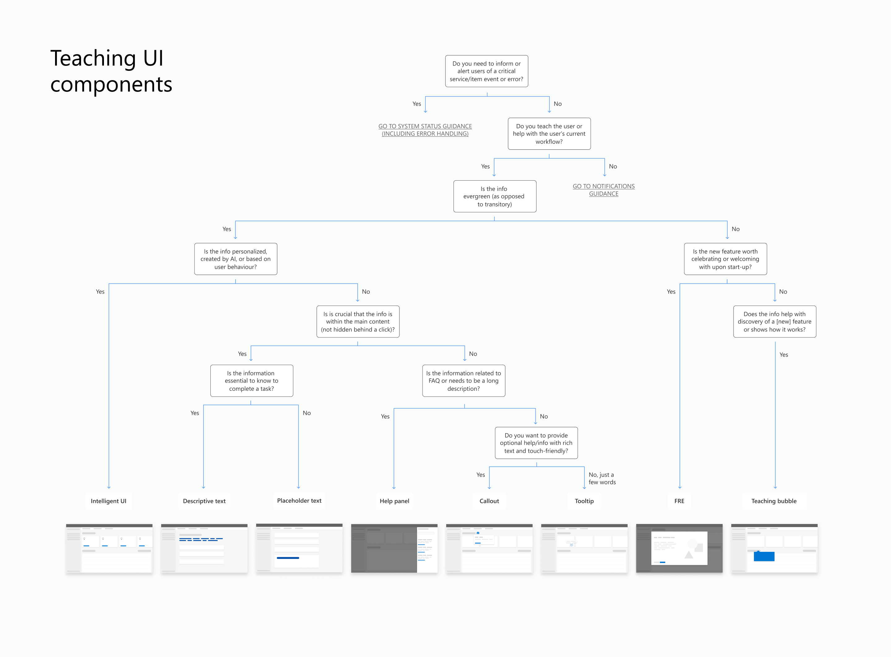
Our team’s approach to the Design System was to treat it as a product—with all the elements that create efficiency and the most impact. Thus, I partnered with a researcher and started by reaching out to our customers—the designers and product-makers of the Core Engineering org—to find out what are the most urgent needs. I used the Jobs-to-be-done framework to help frame the needs through the lens of our end product customers. The main themes were notifications (in a broad sense: errors, push notifications, popups), learning, organizing information, and using grids. That led to prioritization and establishing a transparent process that set expectations and helped with planning.
Aside from the process and driving clarity, I established a framework that provided umbrella guidance for patterns and enabled our Design System designers to focus on individual components. That led to holistic solutions and addressing potential ambiguity. The robust approach of understanding user needs through collaboration with product teams resulted in focusing on the most impactful areas and top pain points.
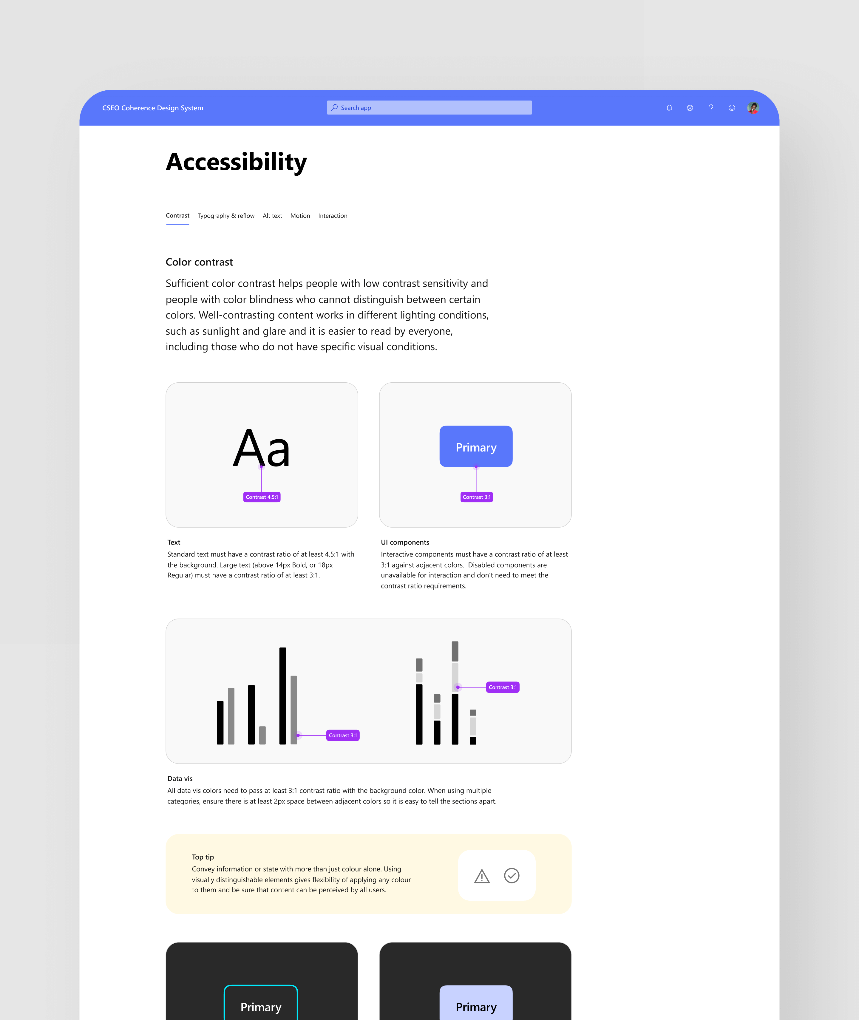
Accessibility
I was the driver of the Design System accessibility. I led multiple accessibility efforts to bridge the gap between the legal requirements, technical implementation, and designers process. My goal was to make the practice of inclusive design easier. I set the design accessibility standards for the org, evangelized, and created guidelines with detailed interaction specs for all of our components. Multiple teams adopted the guidance, including the Fluent Design System team. My work was recognized by many Microsoft teams, including the Central Accessibility team (CELA).
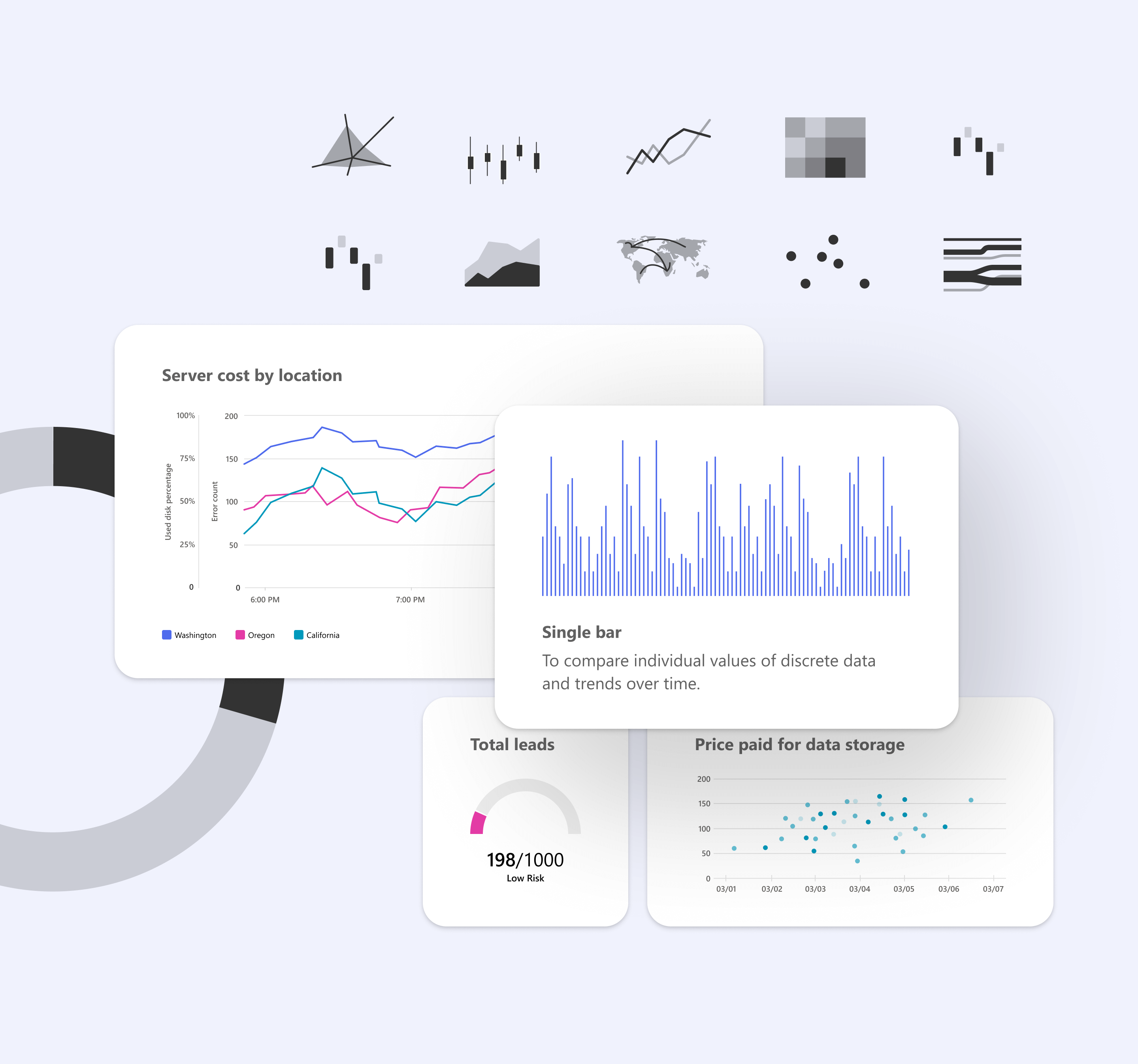
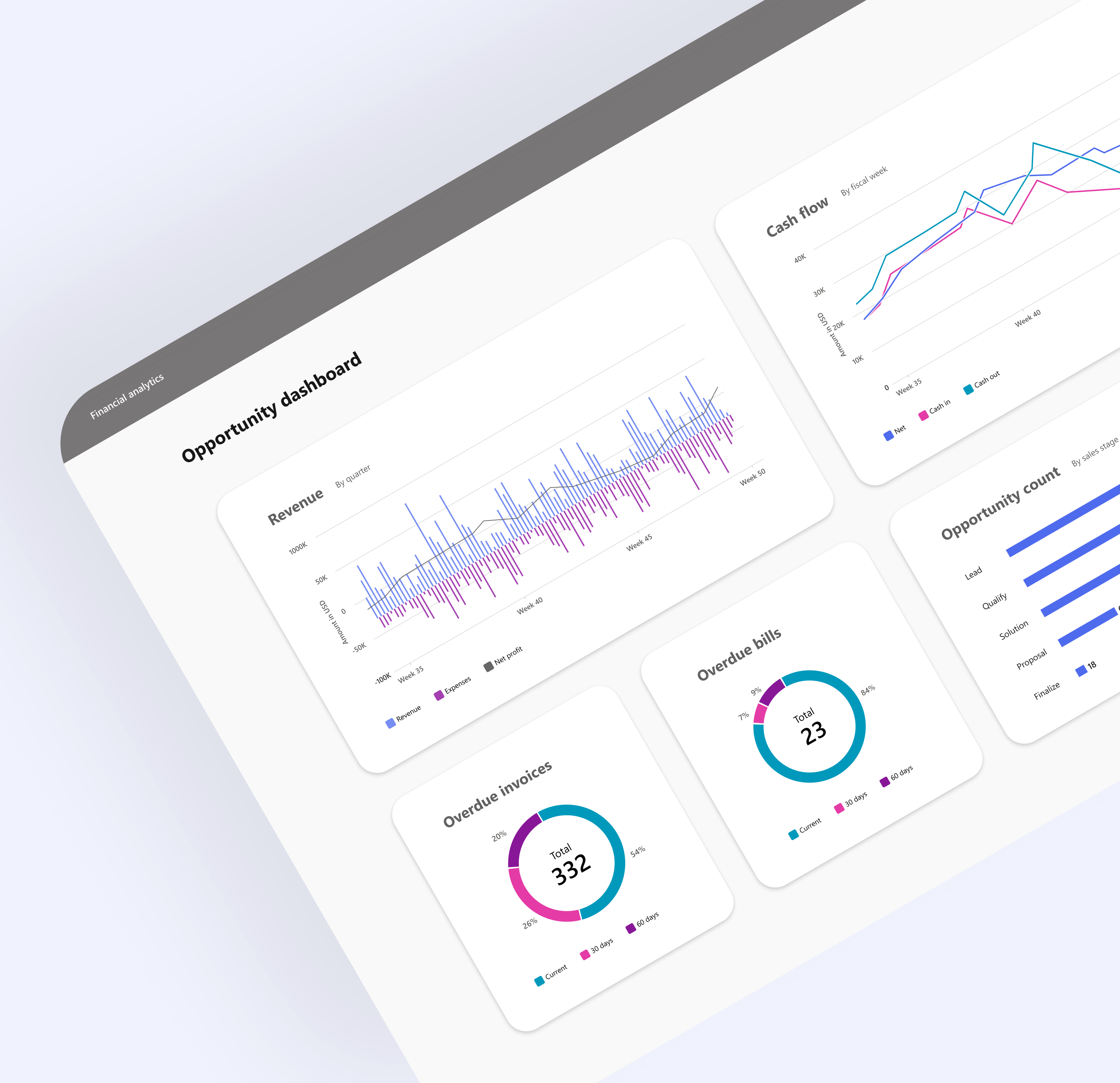
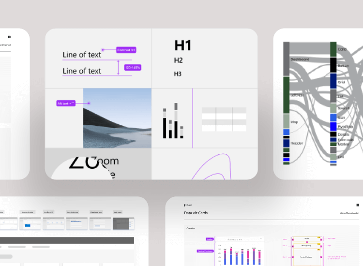
Microsoft data viz
I drove the data viz horizontal team to create a singular POV for the company. The team comprised 18 products and over 30 designers, including Teams, Azure, Power BI, and Dynamics. I was responsible for the process and collaboration. I contributed several patterns by synthesizing and building alignment to converge to a singular solution. Besides evangelizing the work, I had a goal to establish trust, ownership, and engagement among our team members. That resulted in designers personally invested in bringing the patterns organically into their product work. Indeed, the workstream resulted in successful design alignment and drove our POV to code.
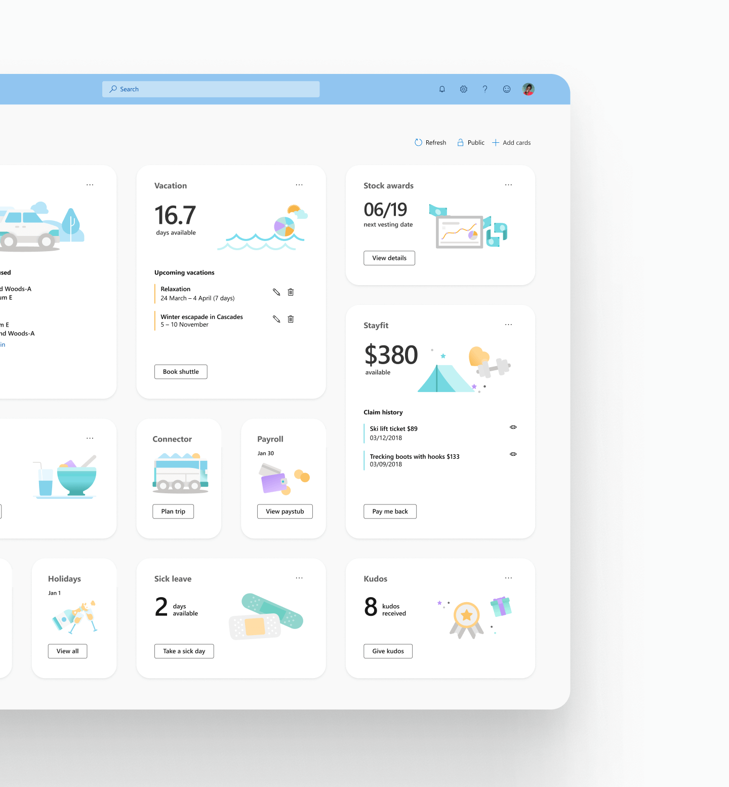
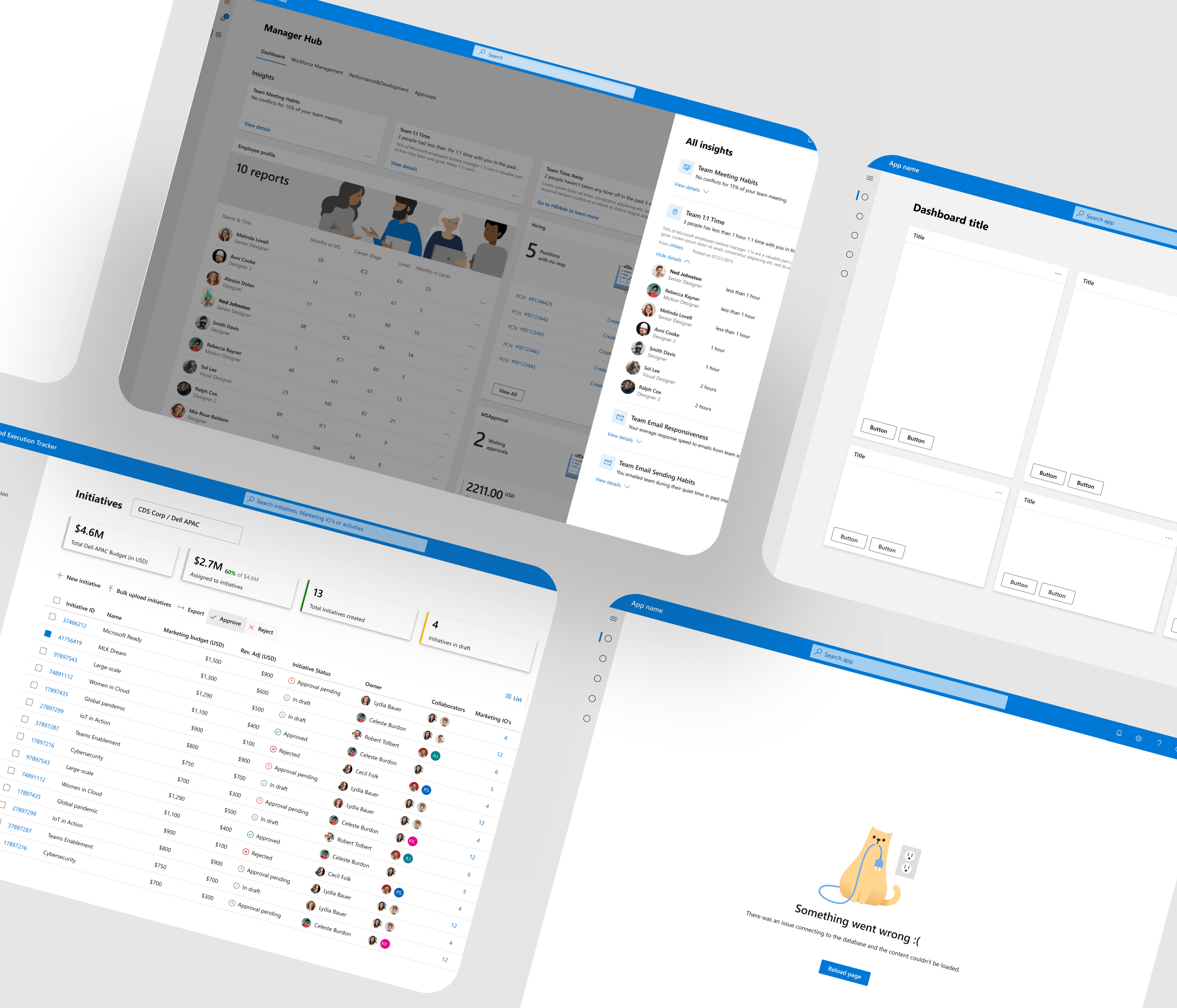
MyHub
I was the Lead Designer for MyHub web—an incubation project later released as Microsoft Viva. MyHub is an employee experience app that increases productivity, connection, and satisfaction. I was responsible for developing app architecture, user interaction framework, and fundamental homepage and dashboard experiences. I used my involvement in that project to stress-test the Design System patterns, ensuring we accounted for edge cases and incorporated customer feedback.