Nintex brand
2018
Nintex
Lead Designer
My Impact
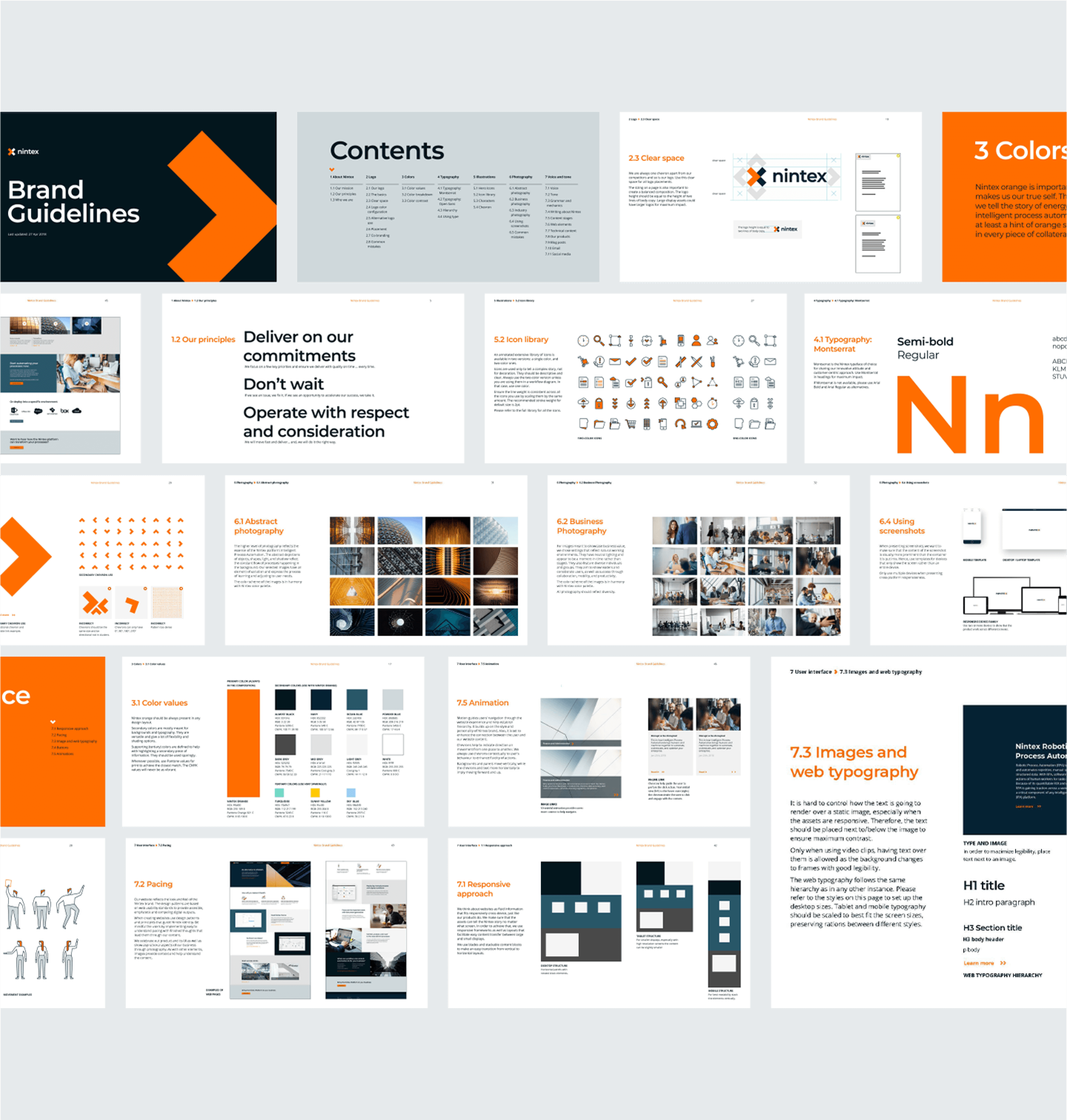
As the Lead Designer, I guided a team of three in developing a new UX flow based on user journeys, ensuring a clear information hierarchy across pages. I worked closely with my team to maintain consistency while simultaneously leading the rebranding effort—from defining the strategic direction to creating a scalable, flexible design system. On the visual side, I developed design patterns and brand guidelines to unify the new identity.
References
Background
Nintex, a workflow automation company, recognised that none of their competitors differentiated themselves to stand out in the market. They engaged our team to refine their brand, positioning, and identity, aiming to establish Nintex as the most recognizable and default “go-to” provider in the industry.
Goal
The objective was to redesign Nintex’s identity to establish a strong industry presence and differentiate the business from competitors. The new visual approach needed to work seamlessly across various assets, from digital interfaces to traditional print and environmental designs.
Challenge
Updating an existing identity required navigating pre-existing conditions, such as maintaining equity in the old logotype and adapting to existing web hosting constraints. Additionally, some of the provided research focused on existing customers rather than attracting new ones. To bridge this gap, we adopted a heuristic approach, leveraging common UI patterns and validating them through early prototype testing.
Process
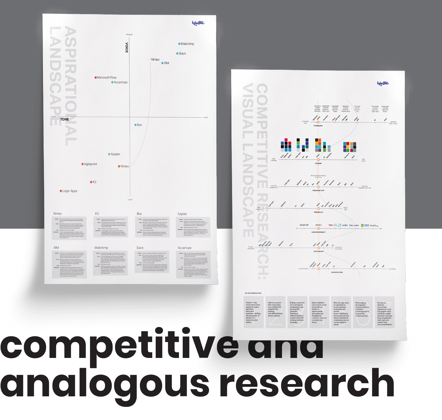
We began with competitive and analogous research. While Nintex had extensive data on competitors, they struggled to translate it into actionable steps. Our team helped synthesize these insights by visually mapping their positioning within the competitive landscape. These visualizations sparked discussions that refined company goals for the website.
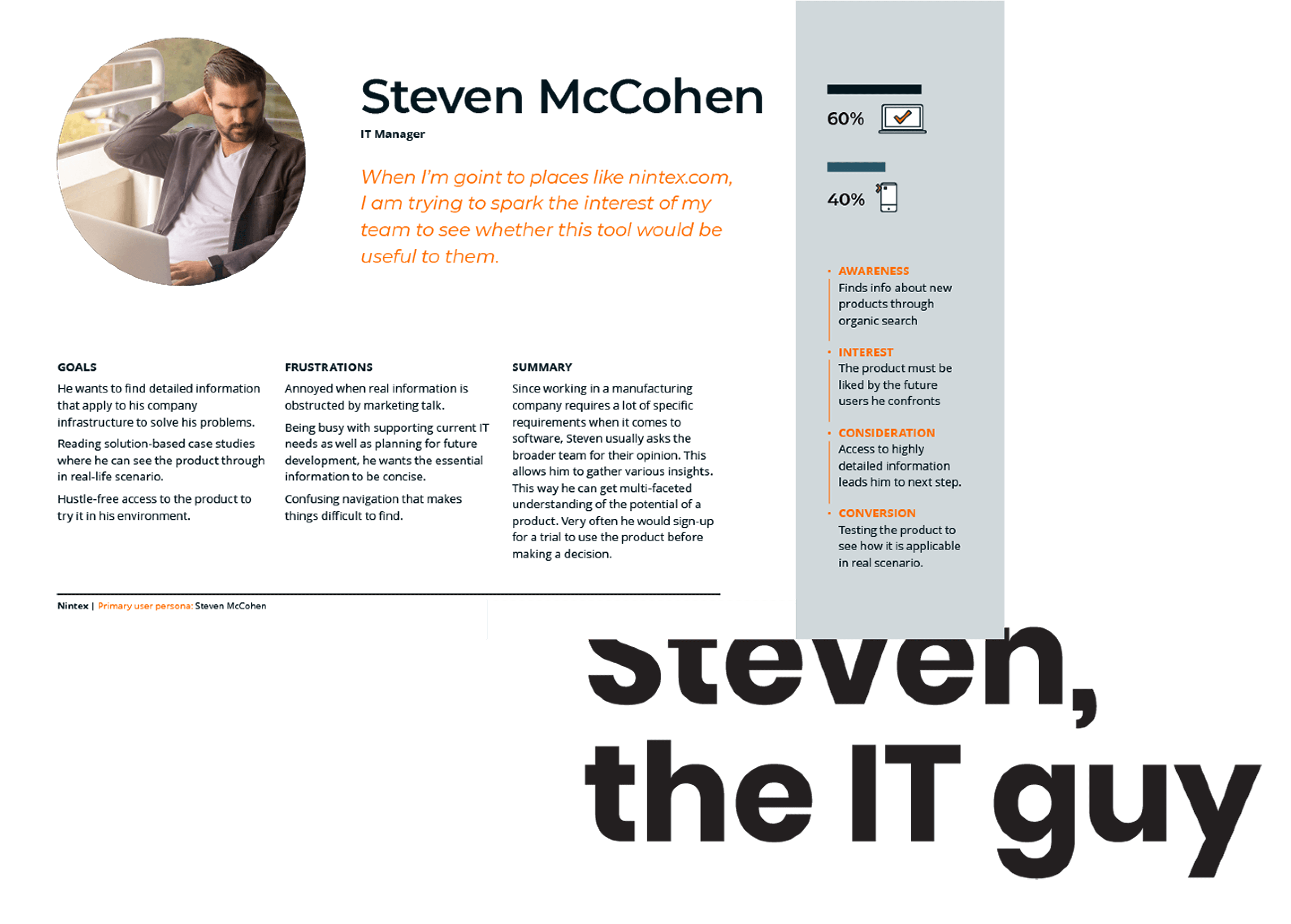
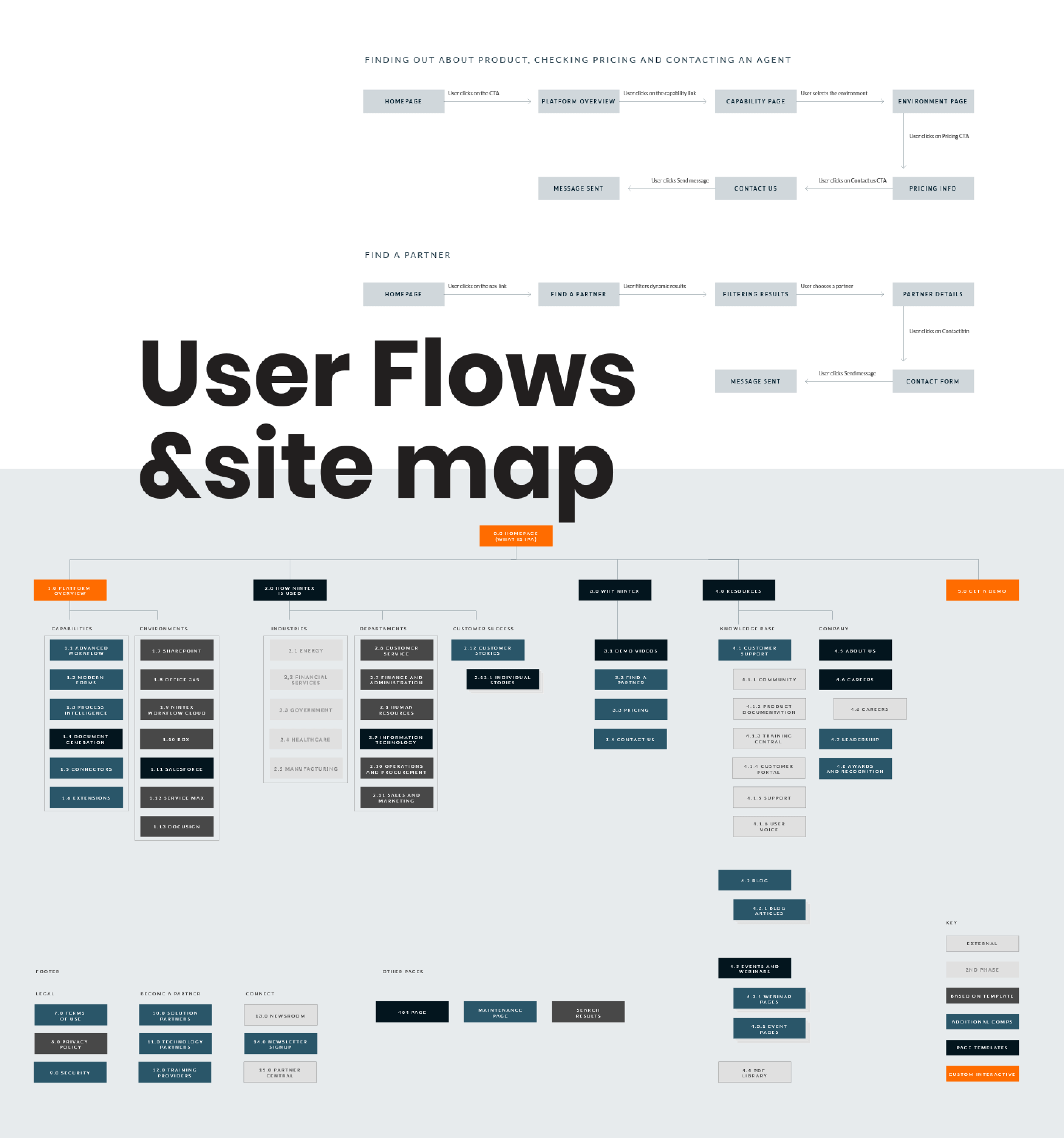
From there, we defined user personas and optimized primary user flows to enhance the new website’s user journey. We conducted a content audit to identify legacy material that needed revision and created a new site map that streamlined information, eliminating redundancies while ensuring clarity.
Solution
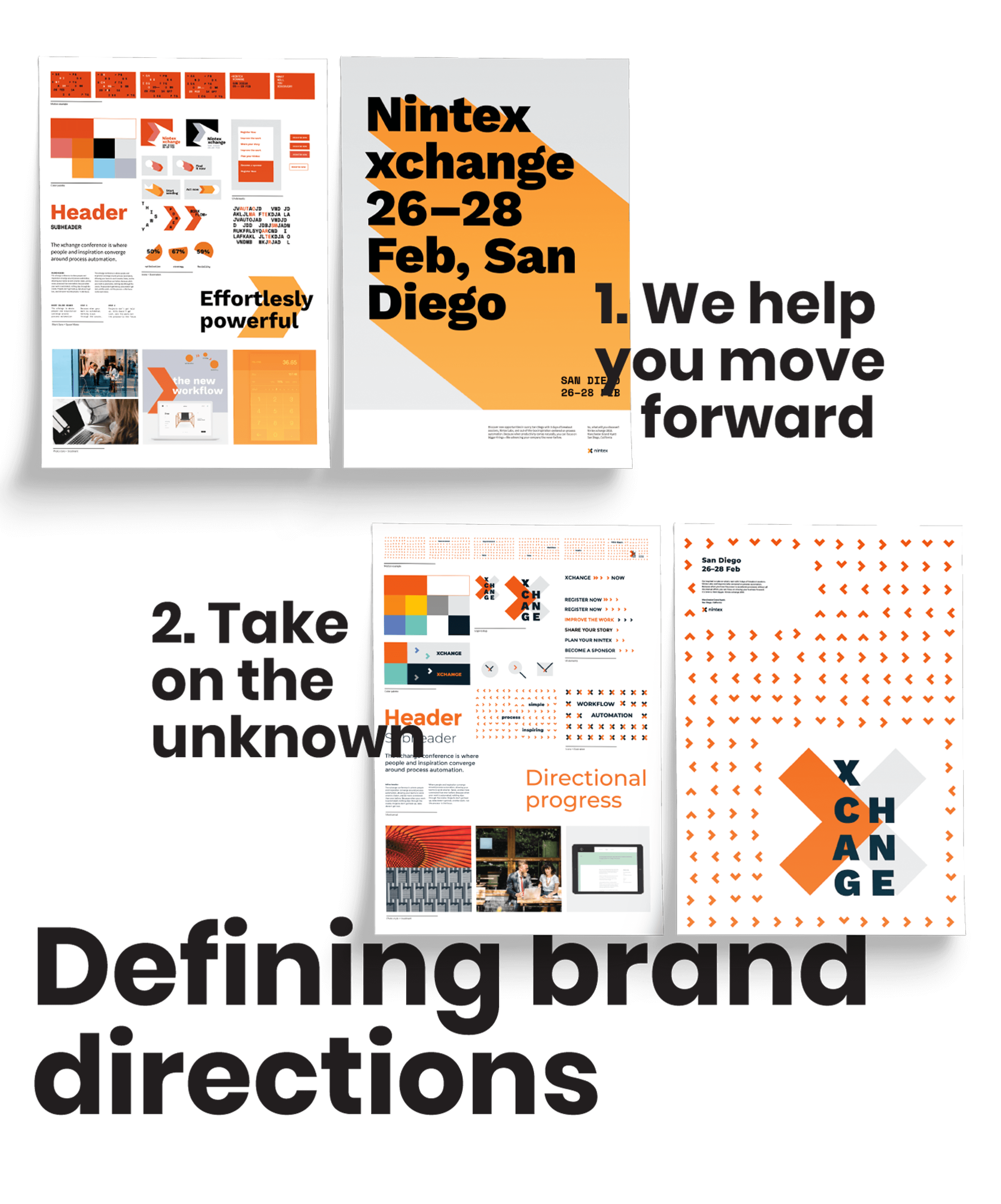
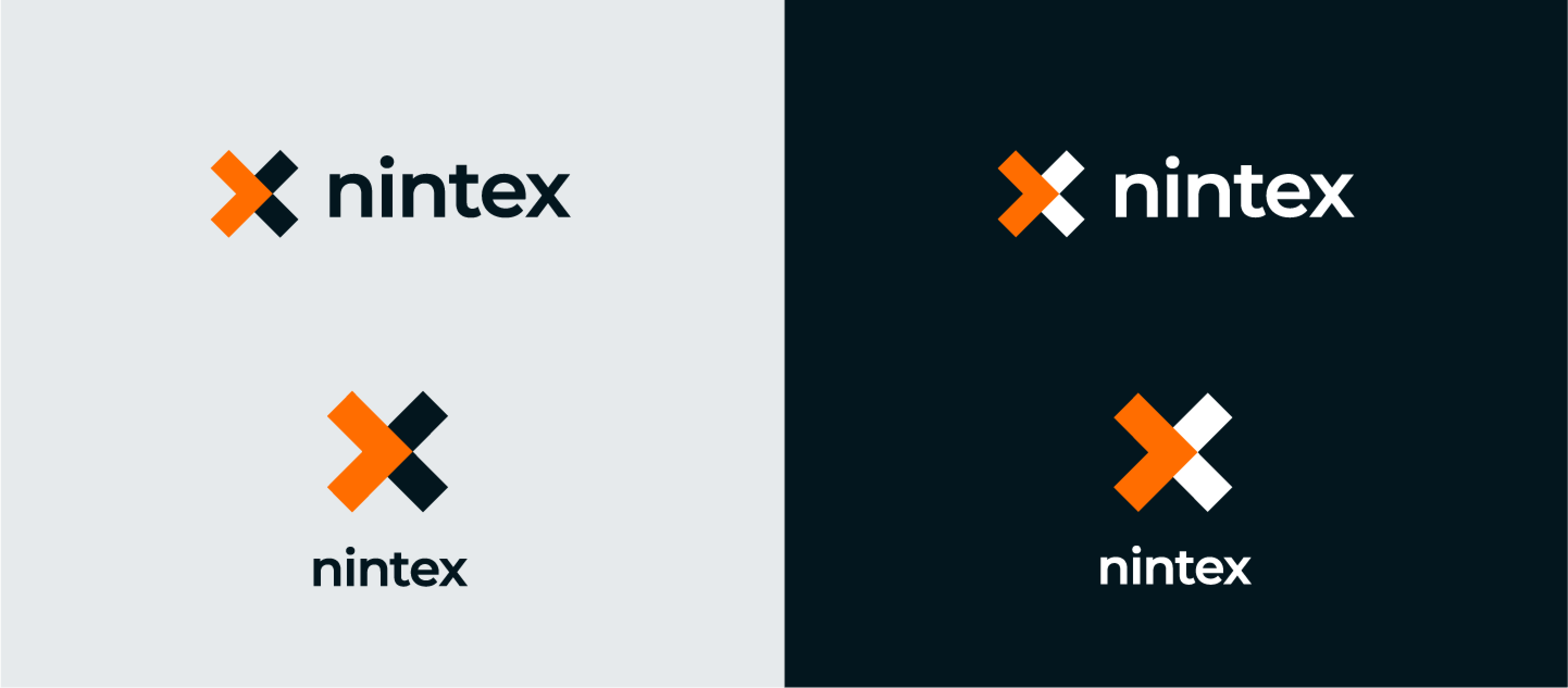
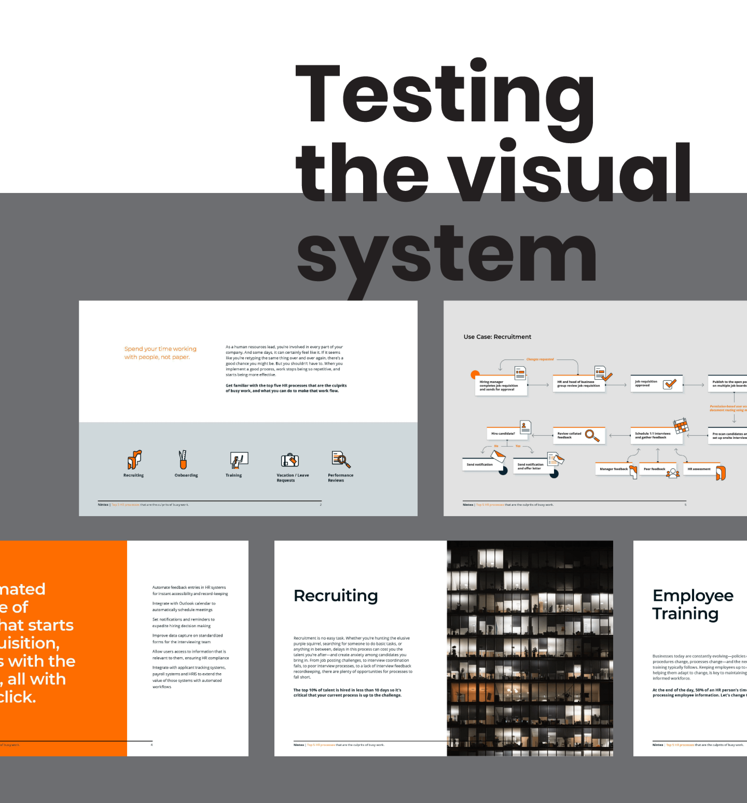
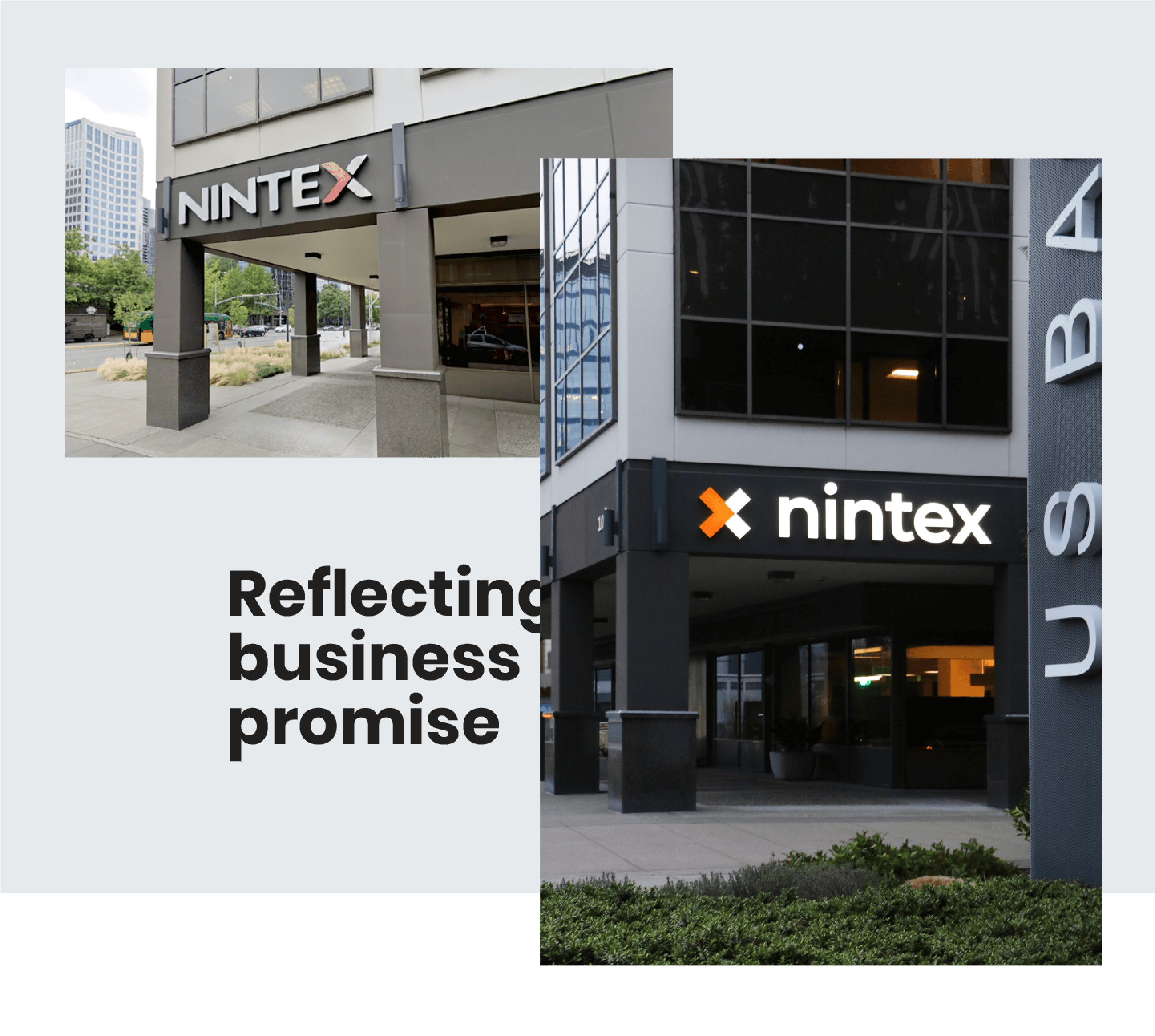
Our research highlighted unique elements of the Nintex brand, including its distinctive orange color, which stood out in a blue-dominated sector, and the letter “x,” which carried strong brand equity. We amplified these elements, refining the brand to feel modern yet familiar—positioning Nintex as a confident industry leader. The resulting visual system balanced flexibility with a structured, cohesive identity.
Website focus
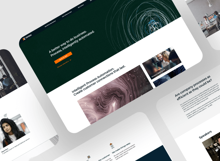
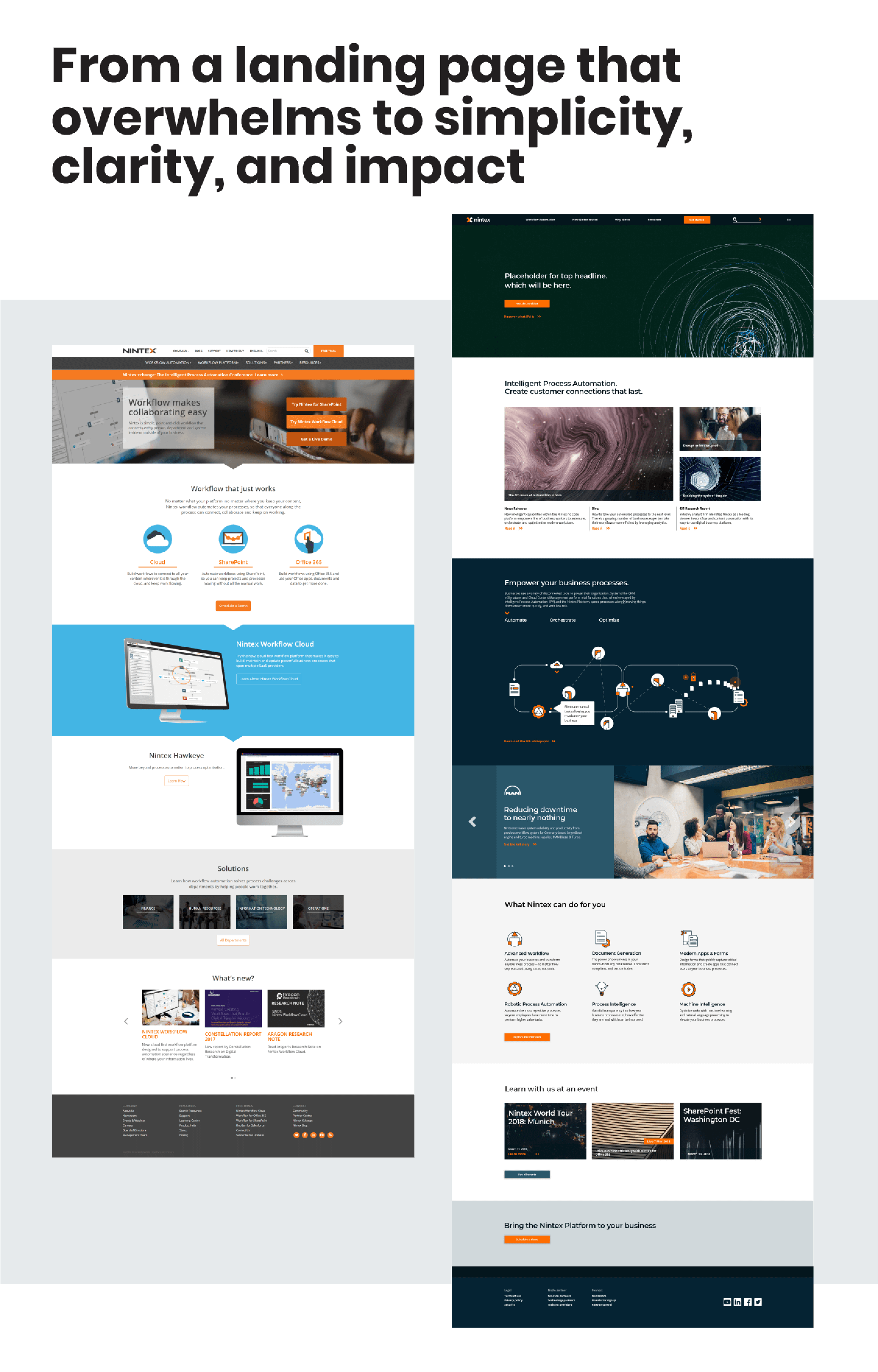
As the most customer-facing asset, the website needed to be more visually compelling and strategically structured. Over time, it had grown organically, accumulating legacy content that diluted focus. Our redesign prioritized clarity, keeping users engaged while reducing unnecessary actions. The business goals centered on increasing conversion rates and clearly communicating Nintex’s services and competitive advantages.
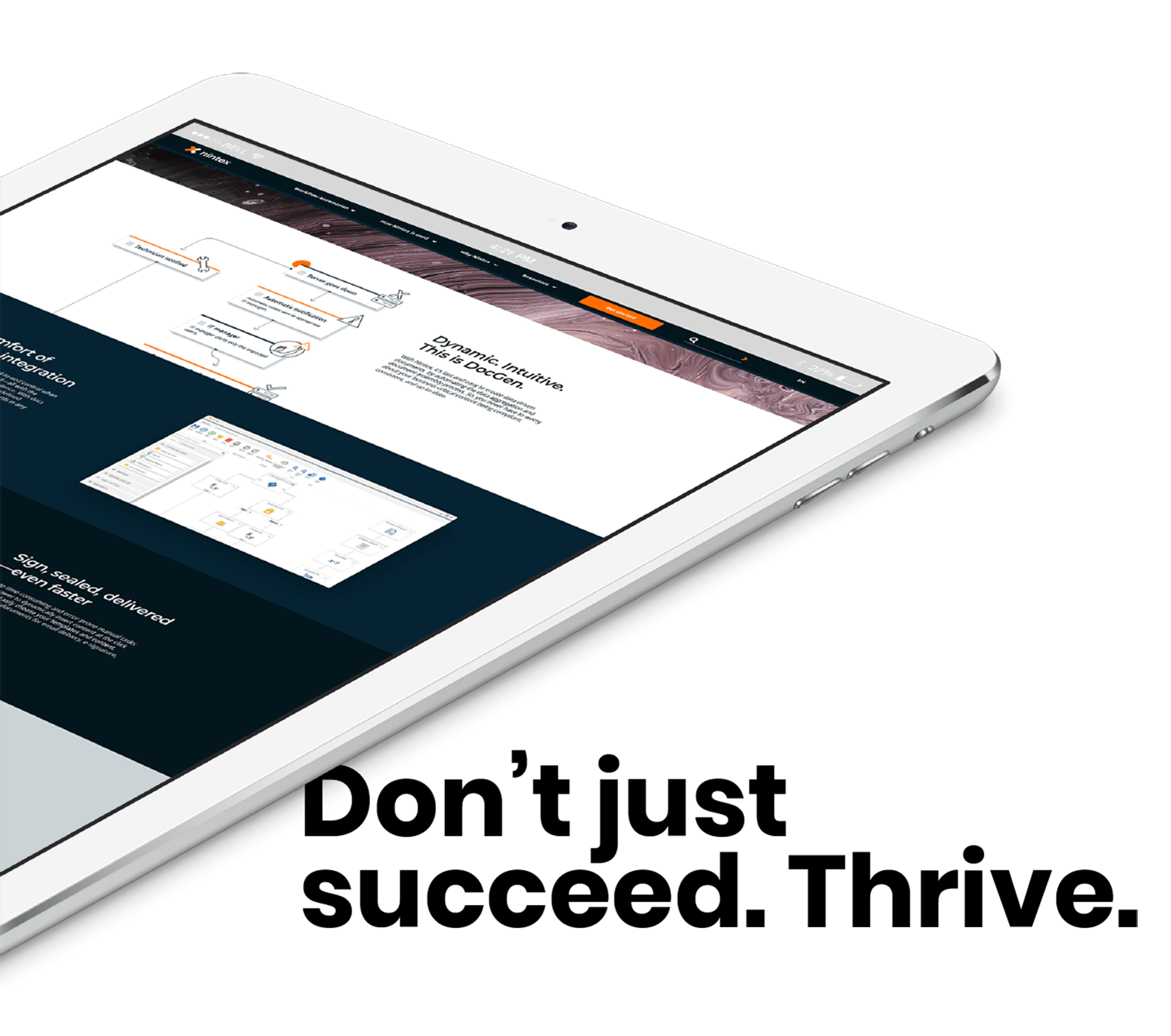
New digital experience
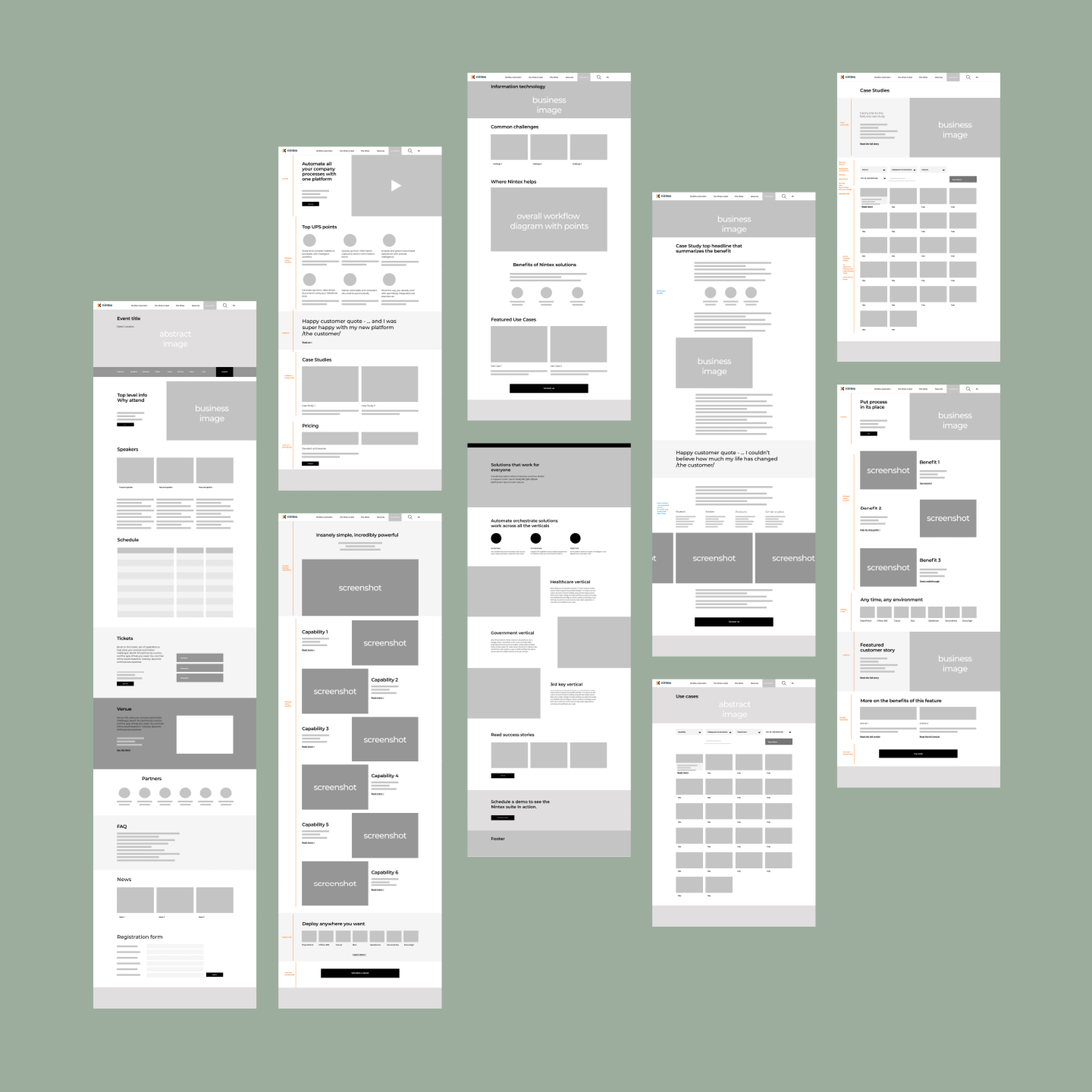
The new website simplifies navigation, reducing cognitive load and optimizing user journeys with contextual information and clear calls to action. We considered multiple user scenarios, accommodating personas such as in-depth researcher who needs a lot of detail and busy professionals who skims content for key information.
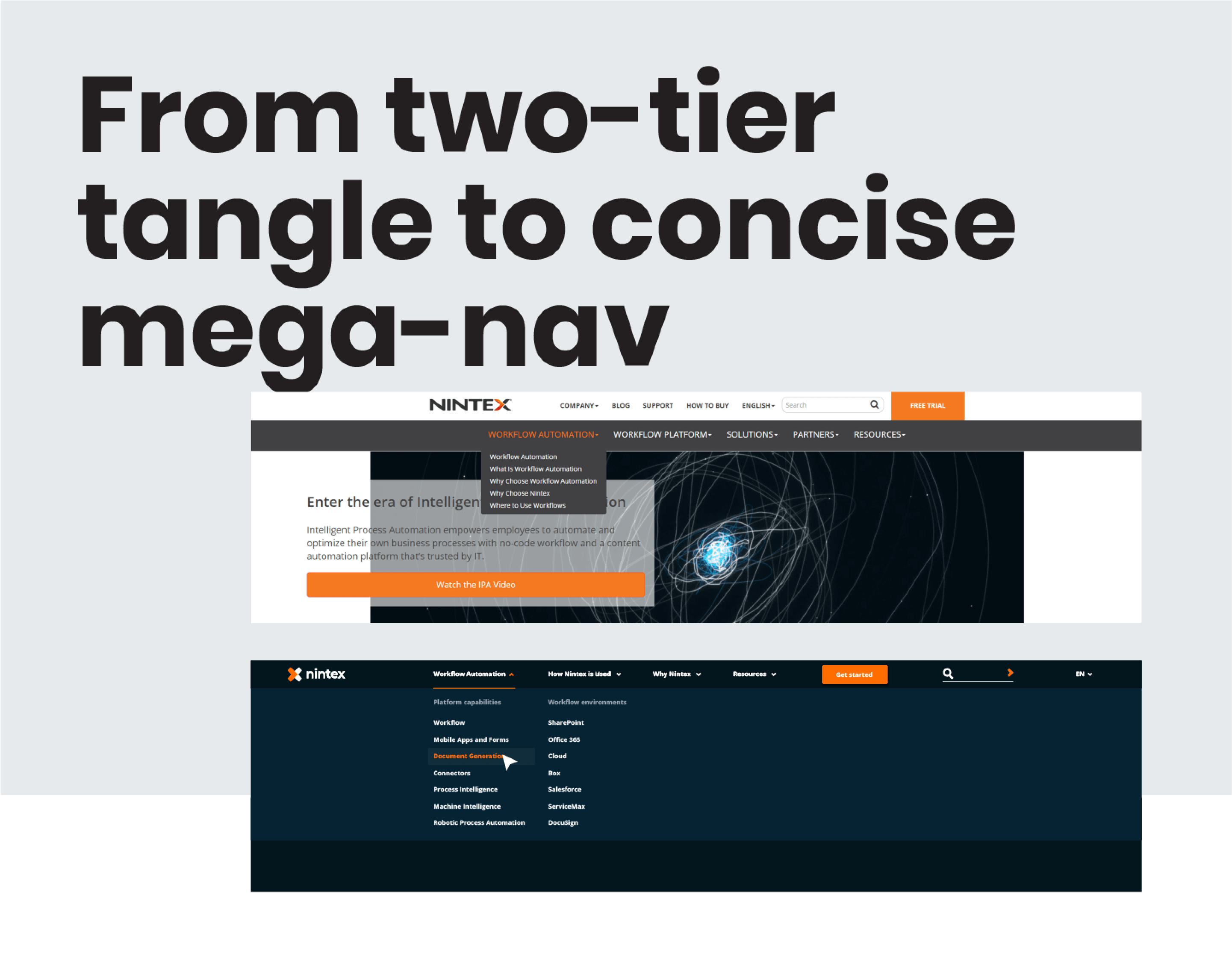
Tighter layouts, a clear information hierarchy, and a strategic use of photography improved navigation orientation. We replaced the complex two-line menu with a structured mega-menu, using principles of proximity and similarity to guide users intuitively. The final design streamlined content presentation, ensuring a more engaging, efficient, and conversion-driven experience.