Office retail
2018
Microsoft Office
Art Director
My Impact
As the Art Director, I led a team of designers and copywriters in reshaping the retail experience and developing campaign concepts. I defined the project methodology, research tools, and workflow to ensure an improved customer experience was delivered on time and within budget. Additionally, I directed photoshoots to ensure they aligned with the brand, told the campaign story, and presented the product in the most compelling way.
Background
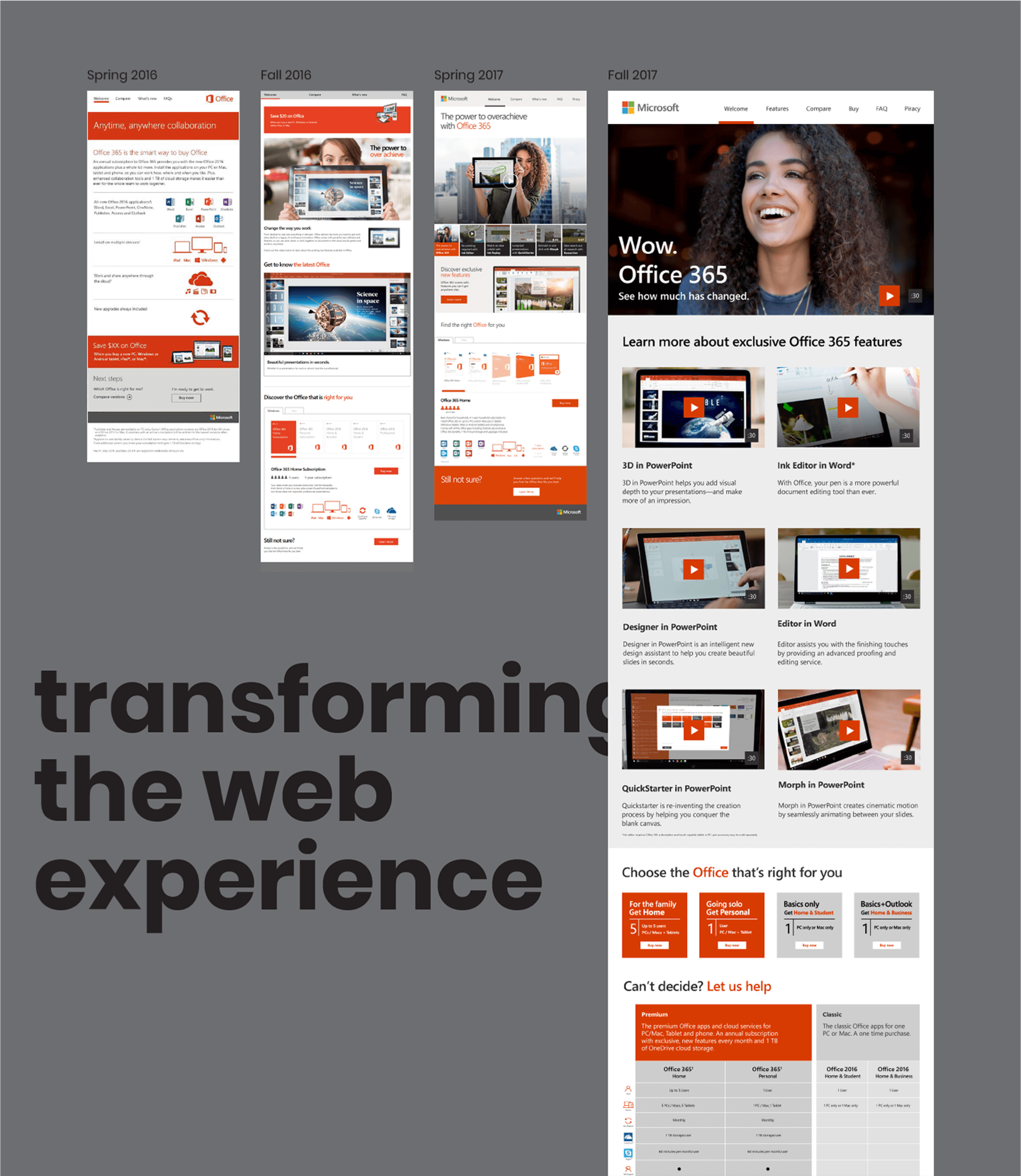
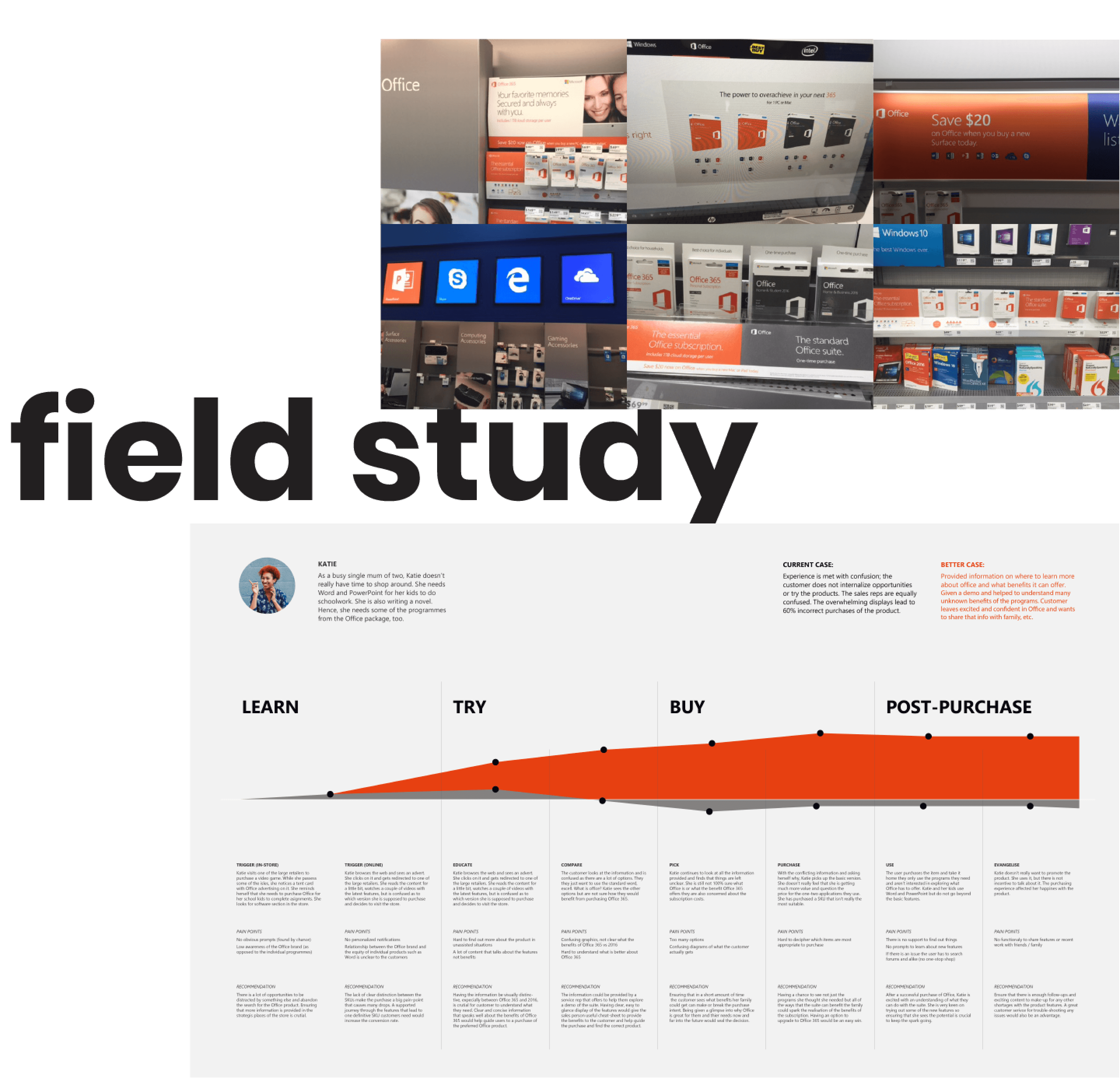
Every two years, the Microsoft Office product team reviews and updates its in-store and online collateral, challenging its effectiveness. Research revealed that many customers were confused about the differences between perpetual and subscription-based Office products. The complexity of the existing collateral led to purchasing mistakes, with over 60% of buyers selecting an inadequate Office SKU.
Goal
Redesign in-store and online assets to clarify product options, support the customer journey, and reduce purchasing mistakes.
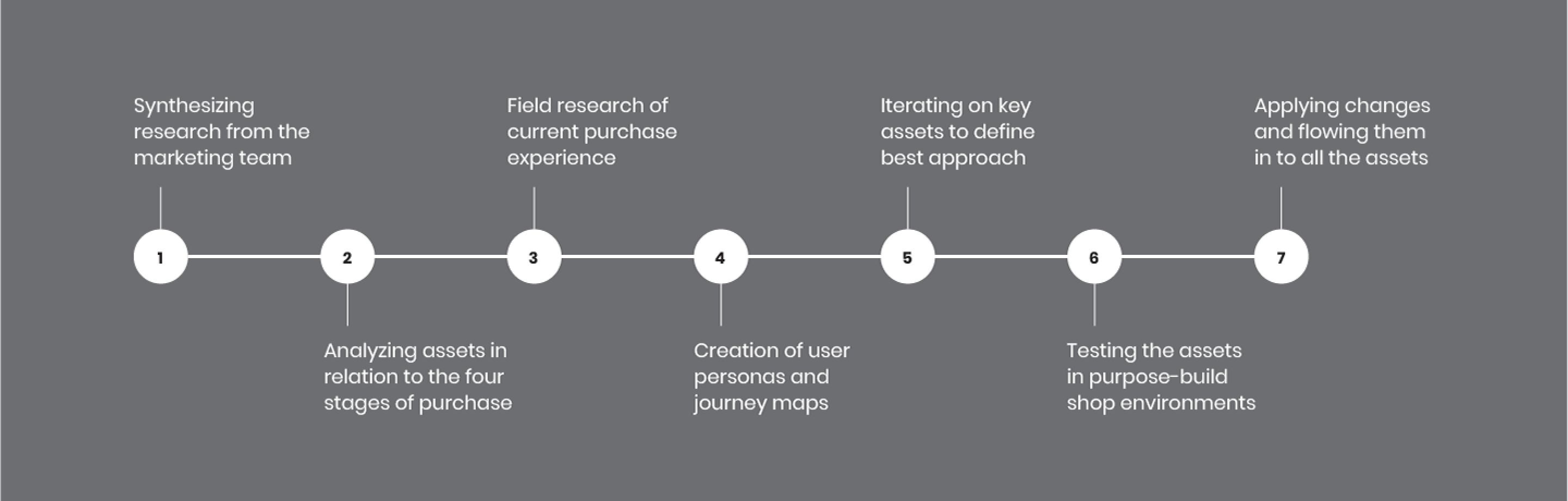
Process
We began with field research, visiting stores selling Office products to assess display assets and interact with customers and staff. Insights showed that while many recognized Word and PowerPoint, they were less familiar with Office as a comprehensive suite.
Based on these findings, we defined two key purchasing scenarios: customers buying Office while purchasing a new device and customers actively seeking to buy an Office product. We mapped user purchase experience flows and created two hero assets to test their effectiveness in guiding users through SKU selection.
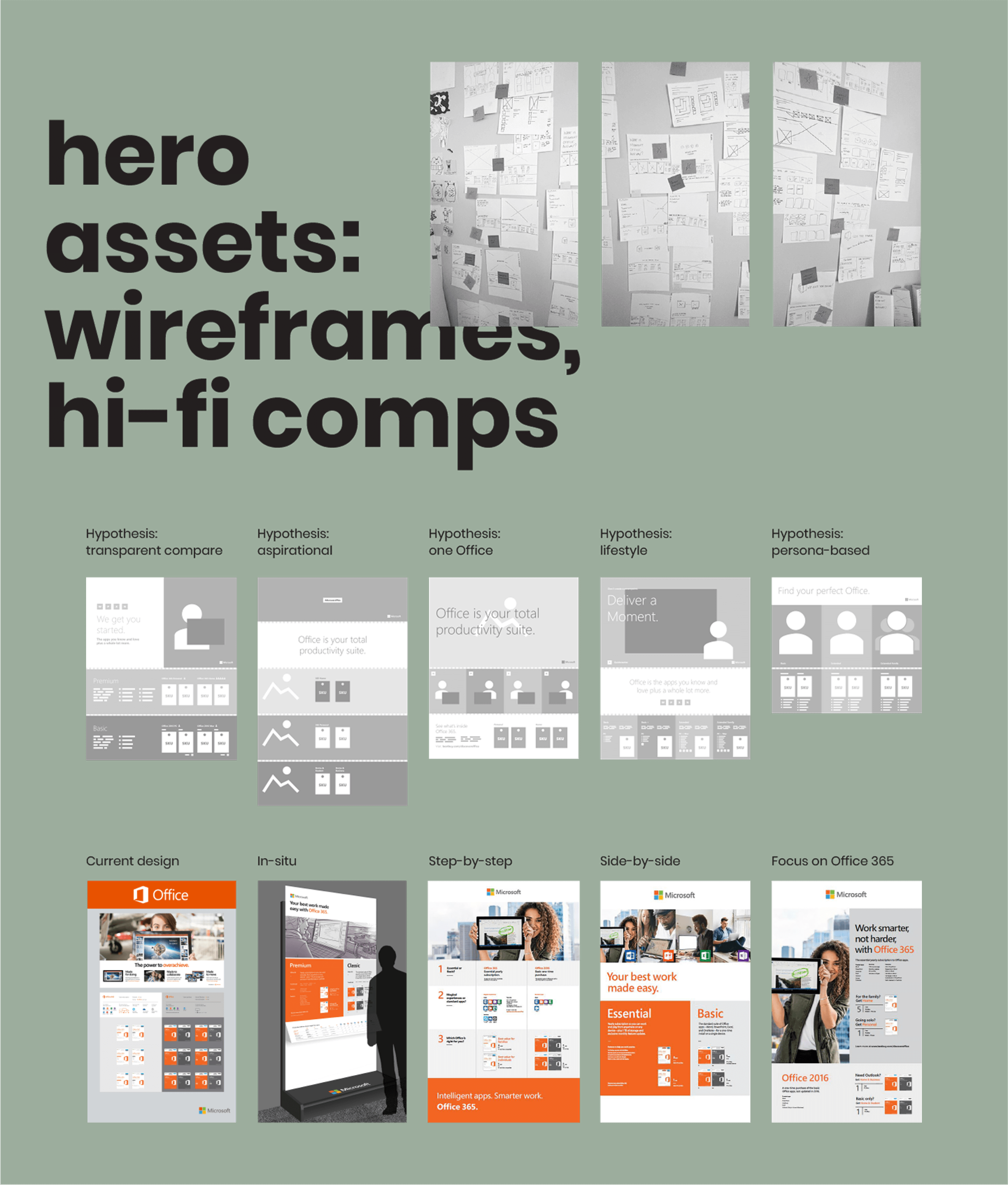
Solution
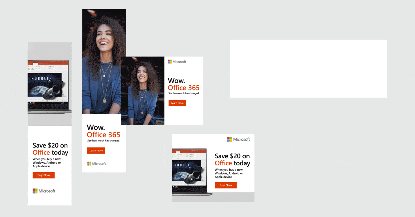
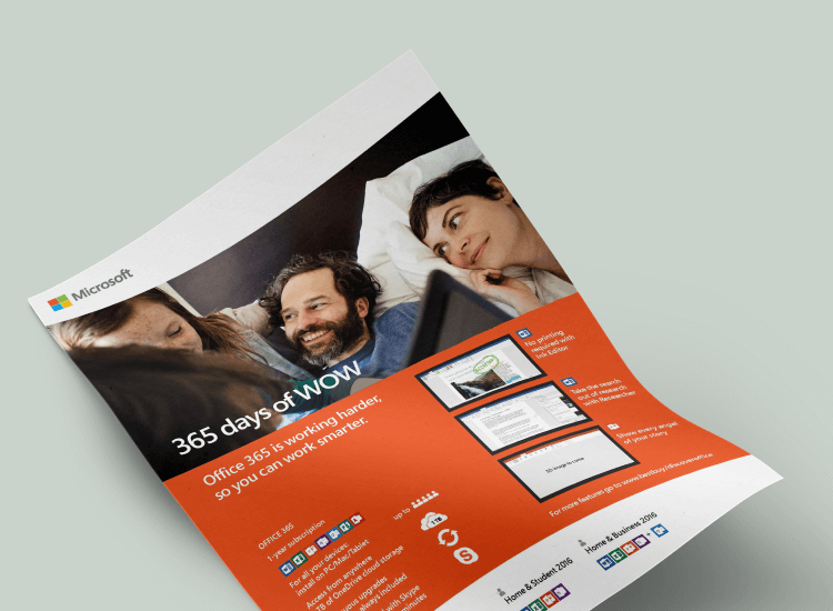
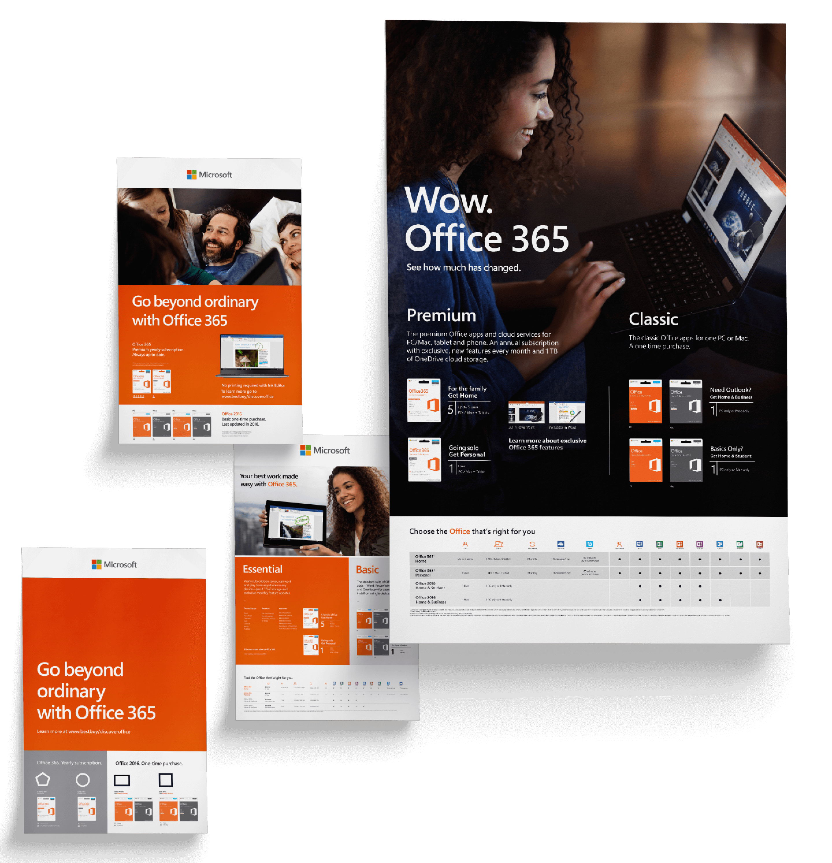
The final solution was a refined set of in-store and online assets that improved customer understanding of Office product options. Collaborating closely with the Office research team, we conducted usability tests to determine the most effective designs. Testing revealed that lifestyle-style banners were more noticeable on social media, while product mockups on computer screens performed better in online stores like BestBuy. Words played a crucial role in conversion, with references to "Office" driving more engagement than specific new features.
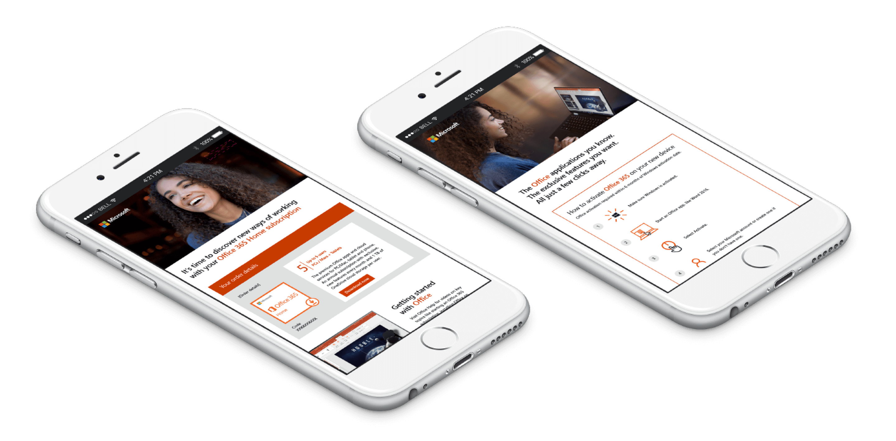
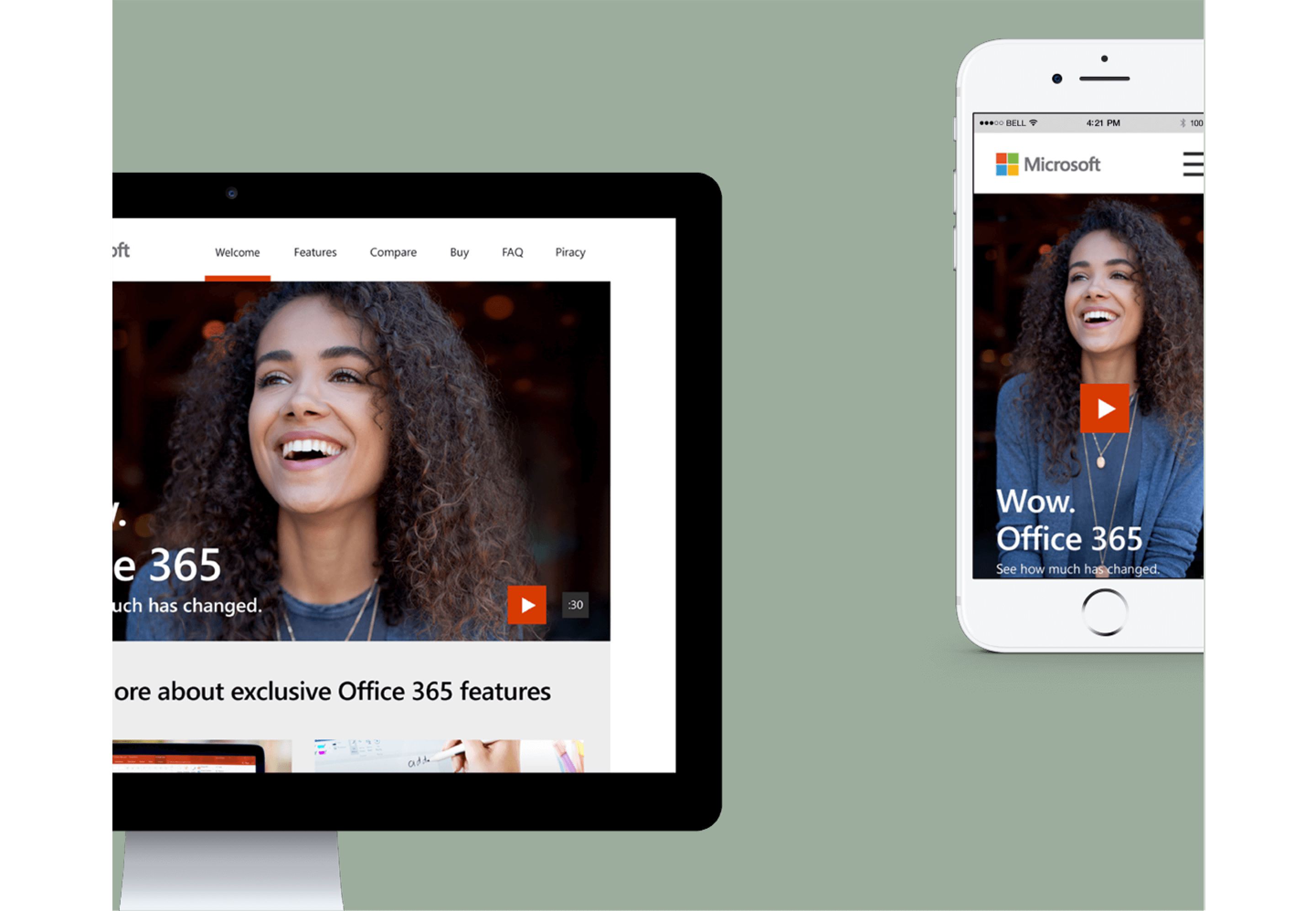
To optimize the online experience, we redesigned the landing page to feature a hero video prominently at the top, replacing the previous zig-zag layout. Below the video, a visual thumbnail ribbon highlighted new product features, making navigation more intuitive. Usability tests confirmed that this approach significantly improved engagement and clarity, ultimately reducing purchasing mistakes.