T-Mobile alert dashboard
2018
T-Mobile
Conceptualization
Art Direction
Visual Research
Positioning
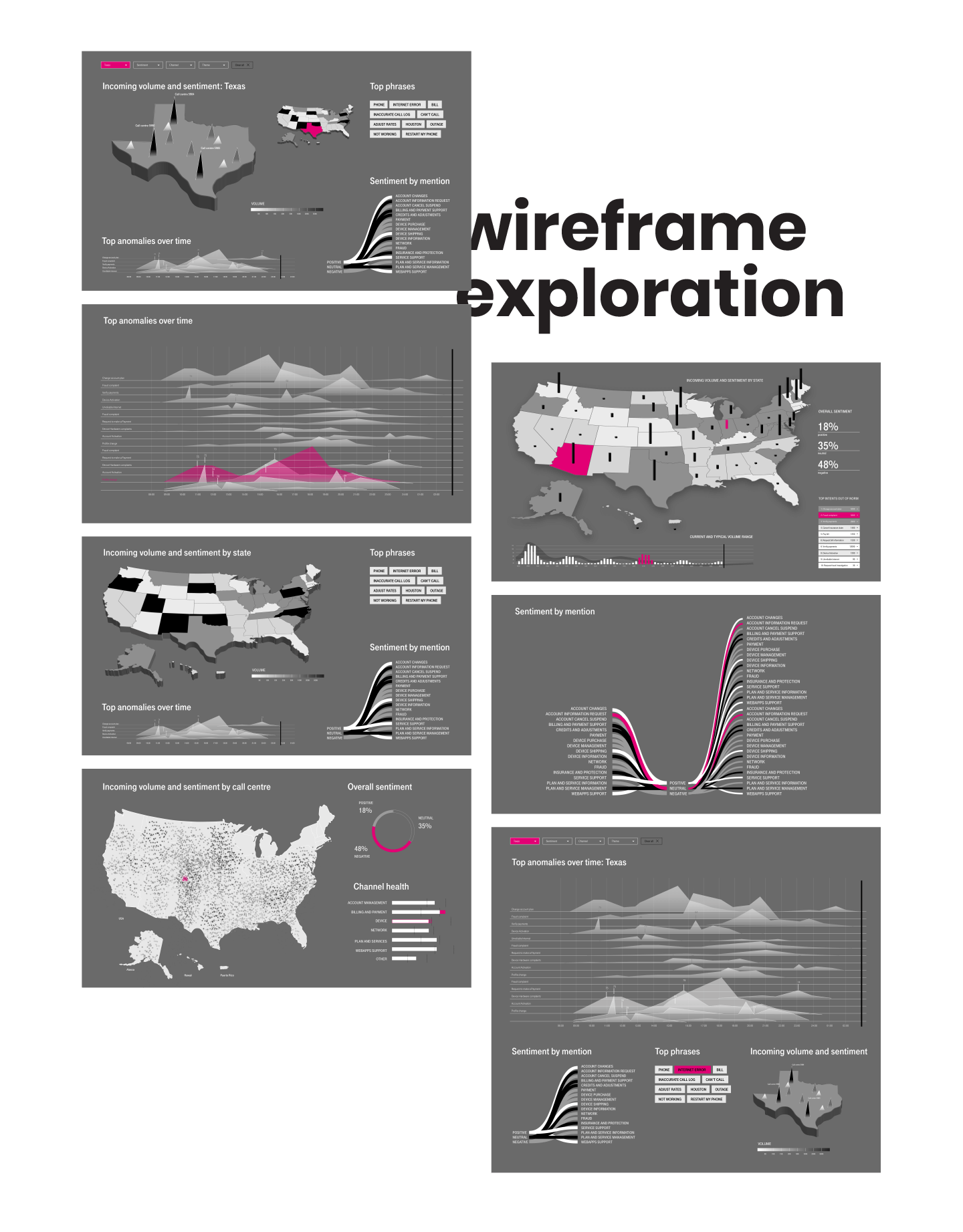
Wireframing
UI Design
UX
Background
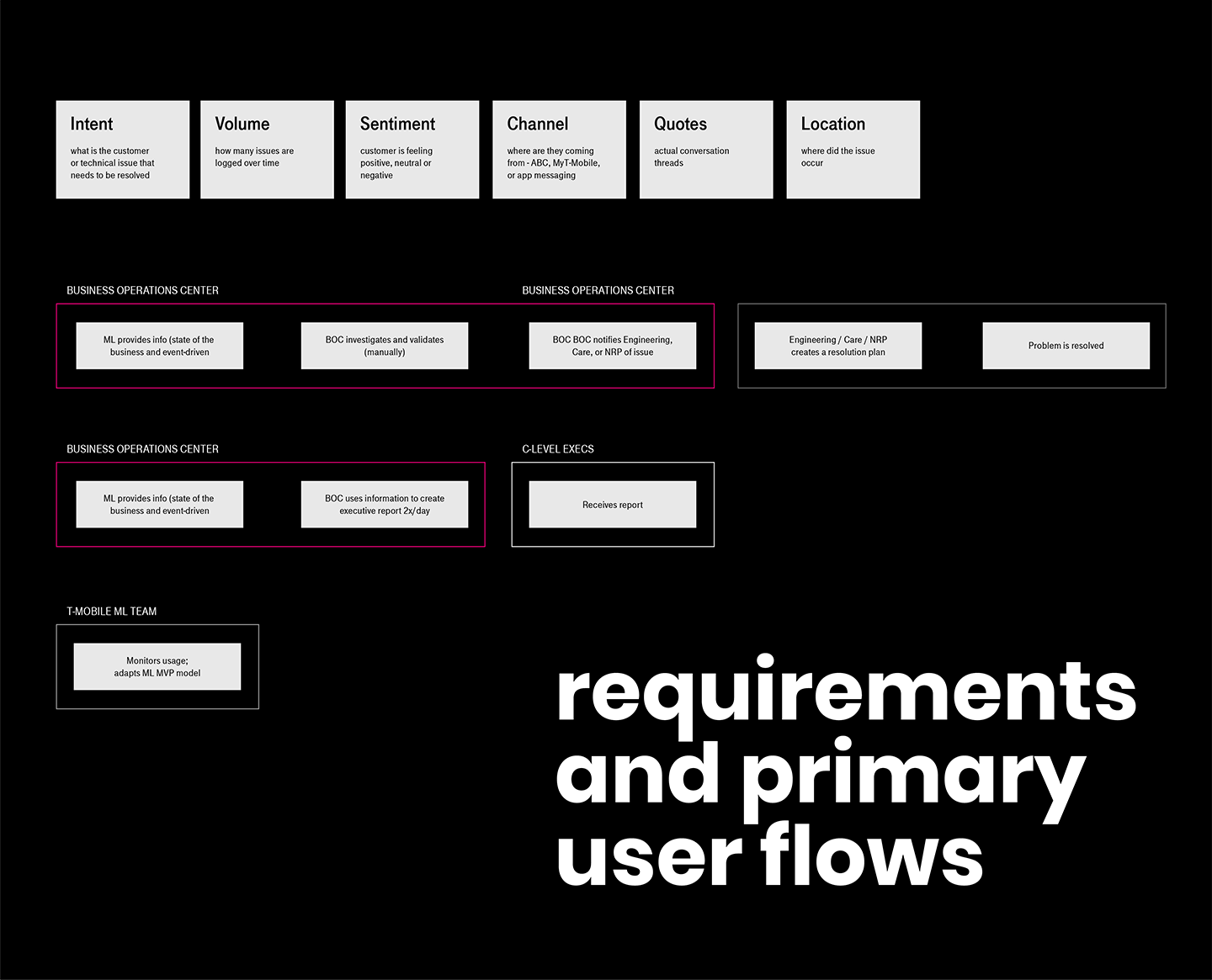
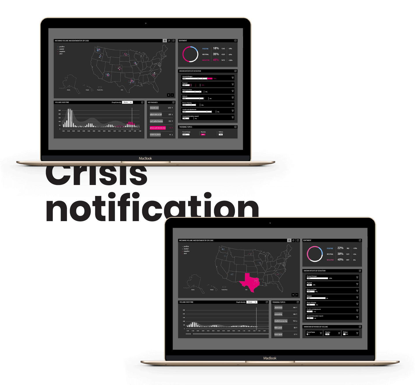
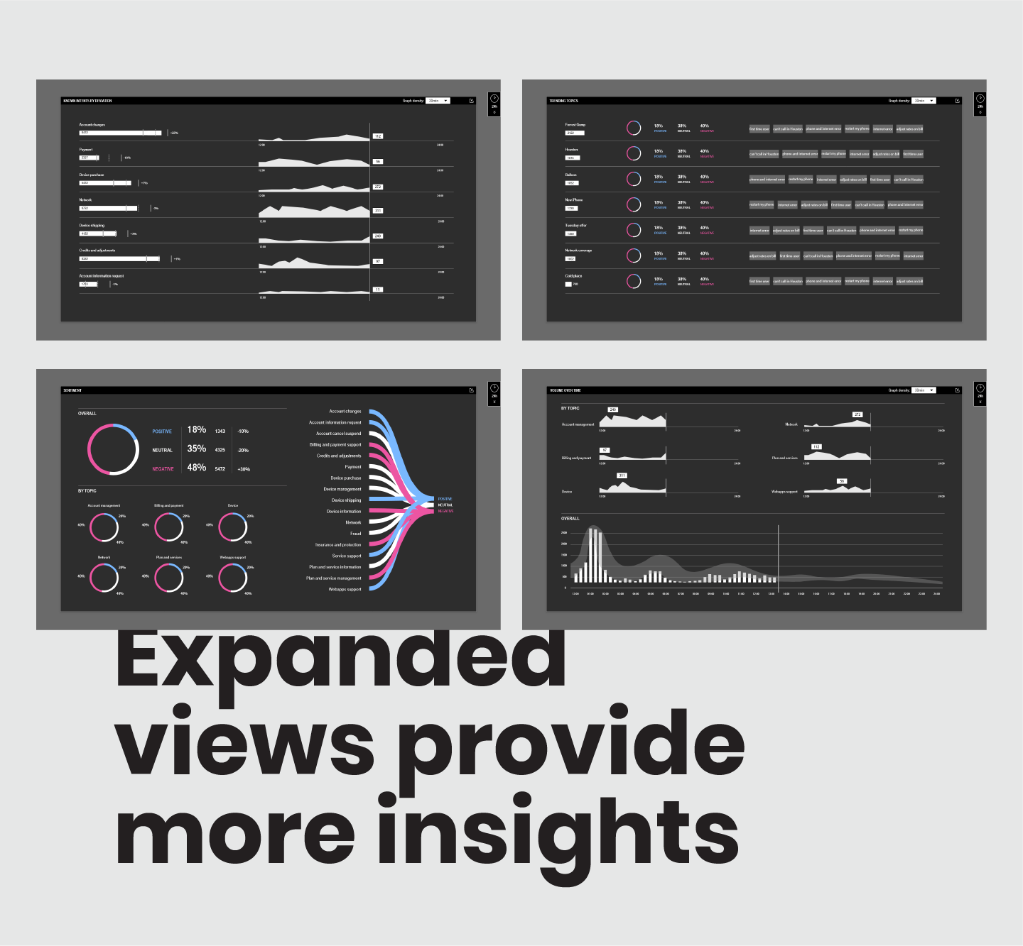
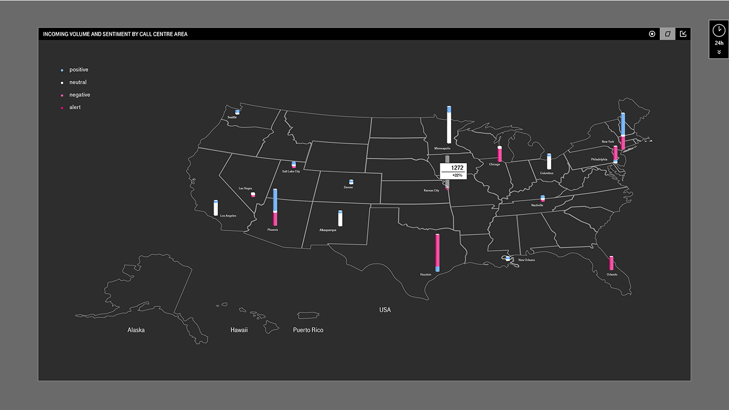
T-Mobile has a “war room” where a customer services team receives information from various channels about reported customer problems. This information is used to identity larger issues such as an outage in a particular area.
Brief
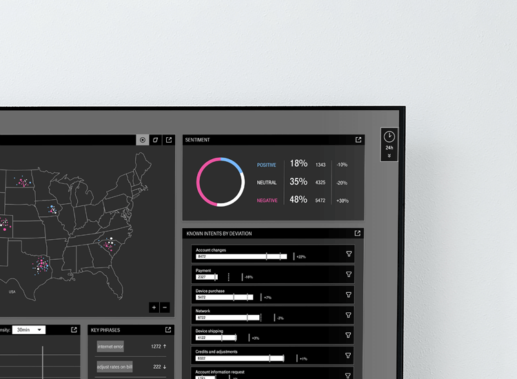
Provide a visual solution that is on brand and extends from being displayed on a large screen within the office to a smaller dashboard that each team member can interact with. Filtering data in order to find potential problem areas is a key feature to be delivered.
Challenge
Since the engineering team was creating a new machine learning model to process the data, it was hard to predict what kind and how much information the dashboard will need to display at any time.
Solution
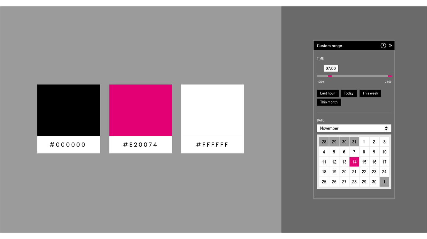
An interactive dashboard with filtering and customization options. A dark background was selected (not a pure black however) due to the past glare issues the team had when white background was displayed on the TV screens. Use of magenta is twofold. On the large screen, it serves as an alert indicator. The default for the dashboard is to be calm and only draw attention when something unexpected is happening. Therefore, due to the high contrast between magenta and dark grey, it stands out when needed. On a smaller dashboard, magenta also guides users in terms of selected elements. Little touches of delight such as animations make the design more engaging and approachable to its users.